The Product Team
--------------------------------------------
--------------------------------------------
3 UI Designers
3 UX Designers
1 Front end Engineer
-------------------------------------------
"Having access to a design system allows designers to complete their objective 34% faster than without one." - Figma
Project duration: On-going
Project duration: On-going
Overview
Develop a simple, iconic, and scalable design system in Figma for Thermo Fisher Scientific's instruments, ensuring clarity for both designers and developers.
The Challenge
Despite being with the team for nearly a decade, we never had time to develop a true design system. I had created a brand guide, but it wasn't enough to standardize our products. At Life Technologies, I had to hit the ground running, focusing on proving design's value in driving sales. As the company expanded - adding Ion Torrent, Thermo Scientific, and eventually, Gibco, design inconsistencies became evident. To unify our growing portfolio and strengthen brand identity, a comprehensive design system became essential.
My Approach
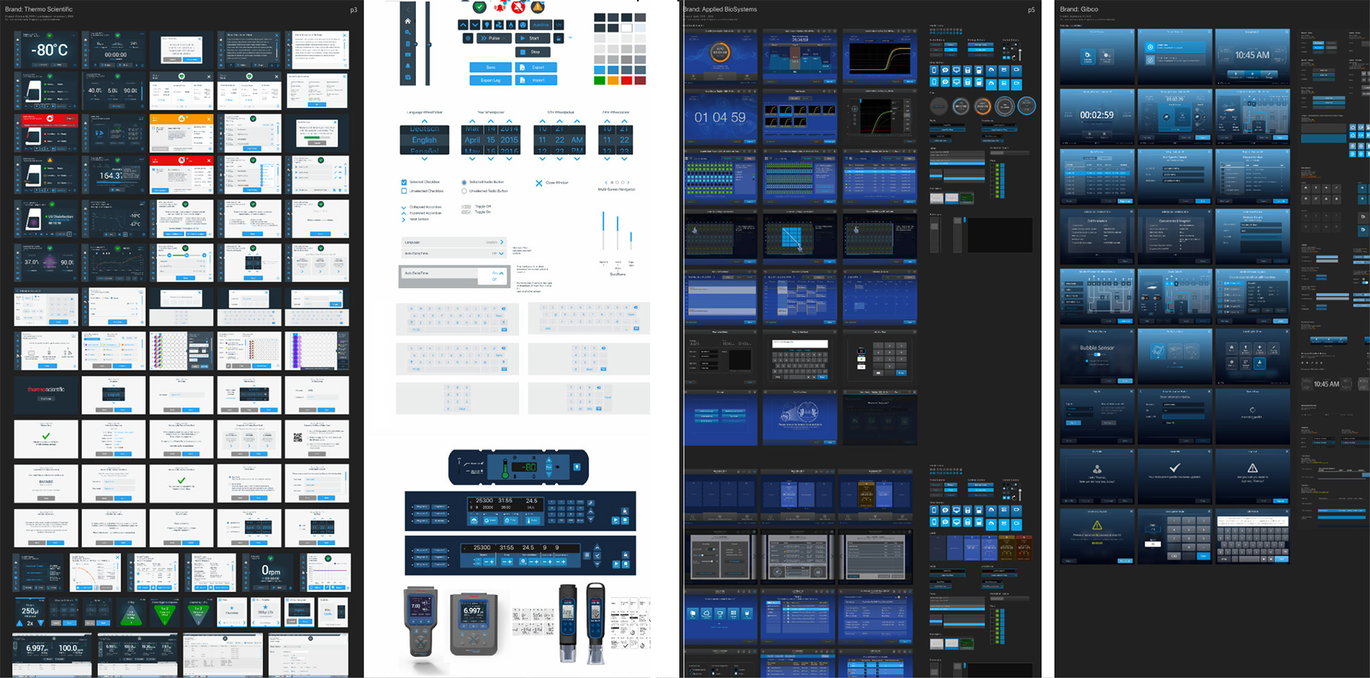
As the lead UI designer, my focus was to develop a new digital system with a unified look and feel, that was adaptable across Thermo fisher Scientific's product line. I led with a comprehensive (internal) audit of our existing systems. The focus of this audit included identifying:
1. All the diverse brands of embedded UIs over multiple years
2. Consistency between visuals, touch points, colors, and status indicators
3. What to simplify, modernize, and keep consistent across our new brand
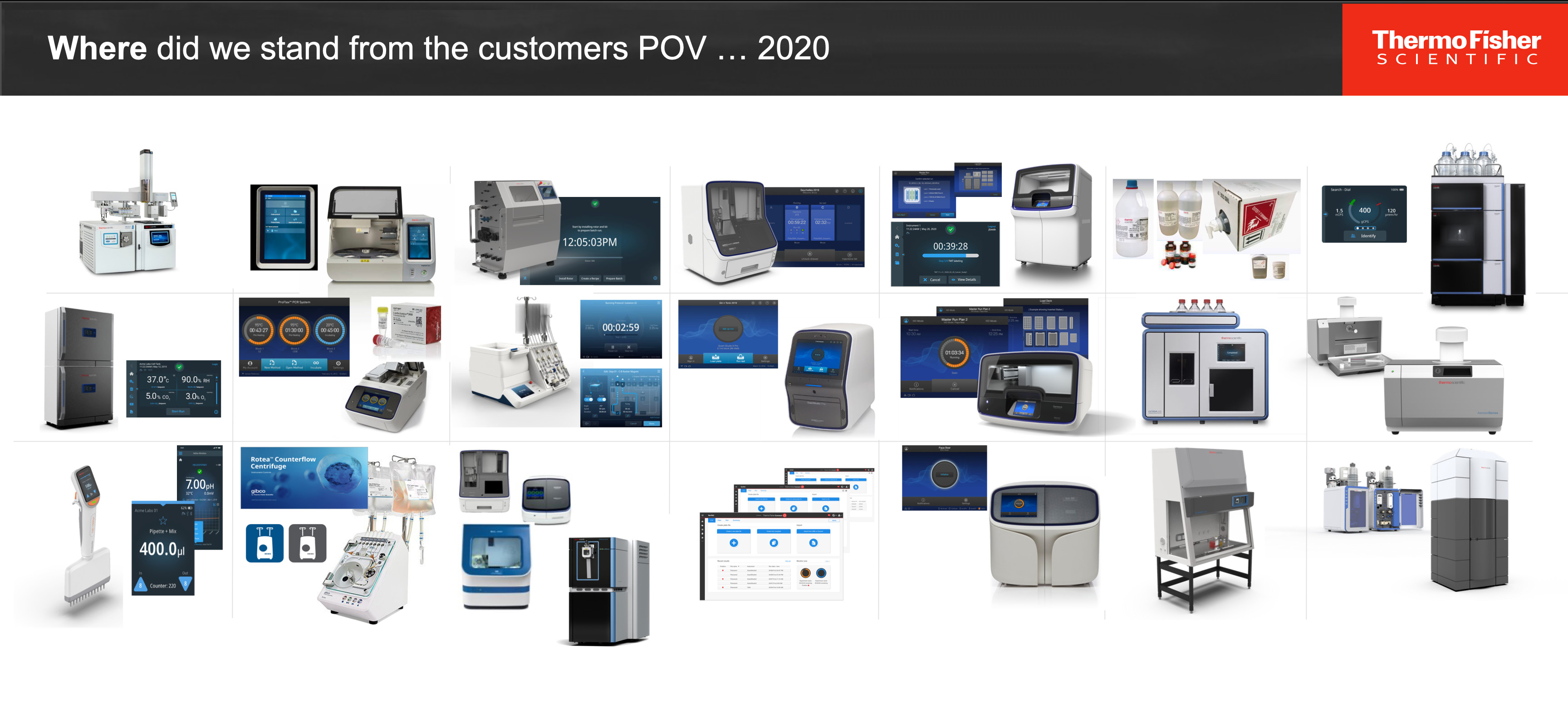
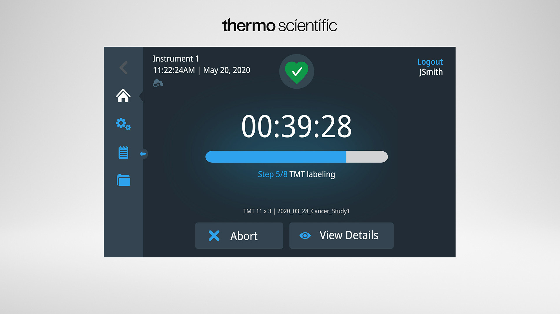
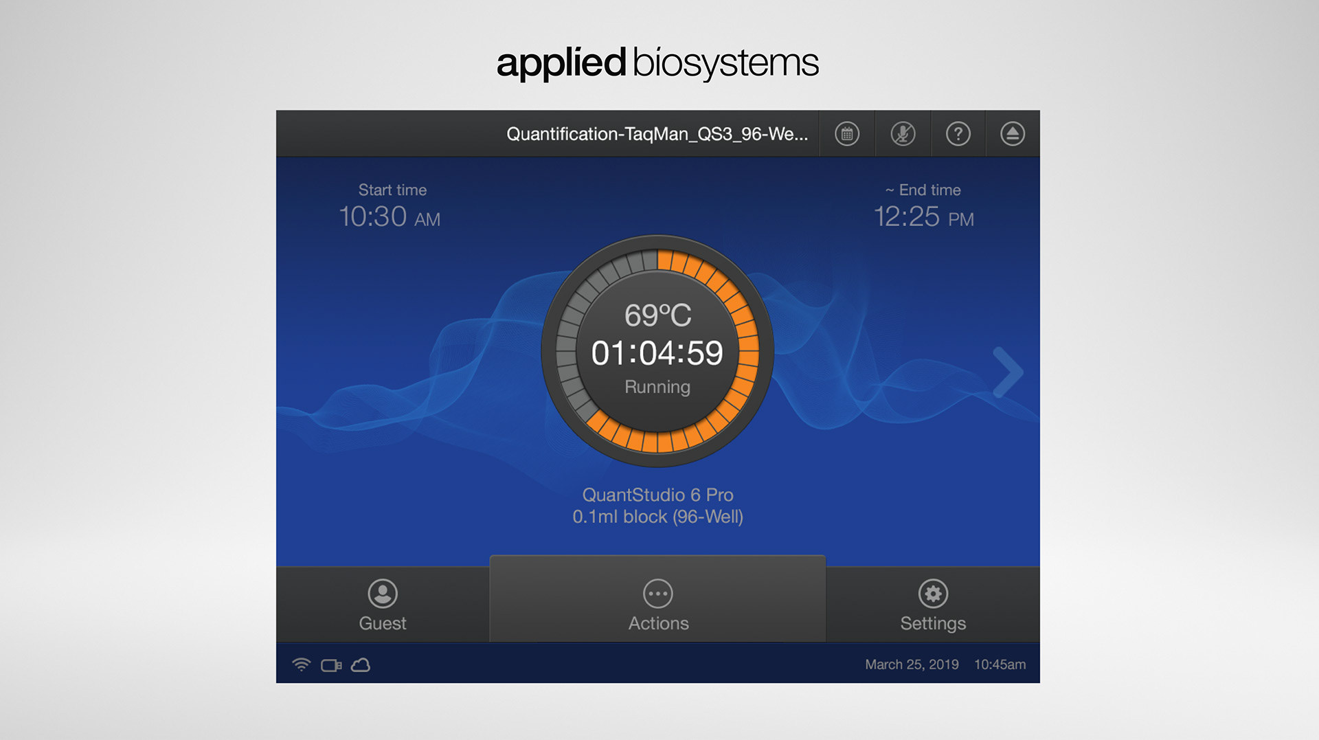
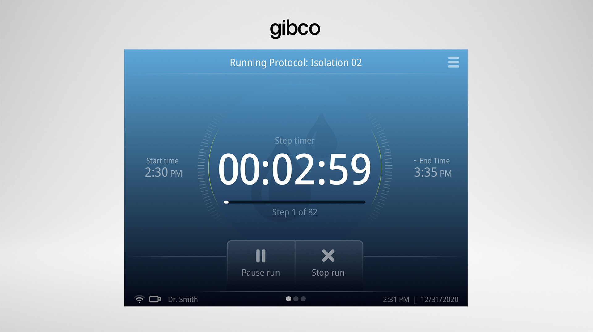
Below are the 3 main brands we focussed the audit on as well as some of the components they entail:
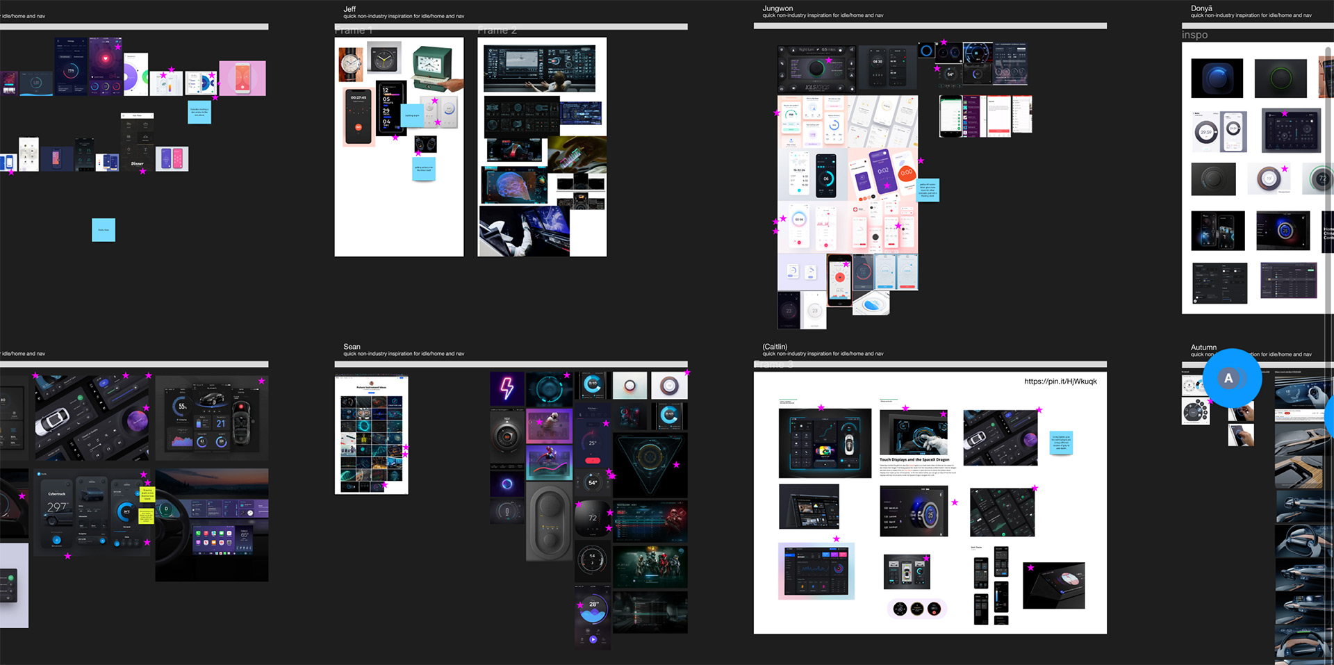
Next Step - Non Industry Evaluation
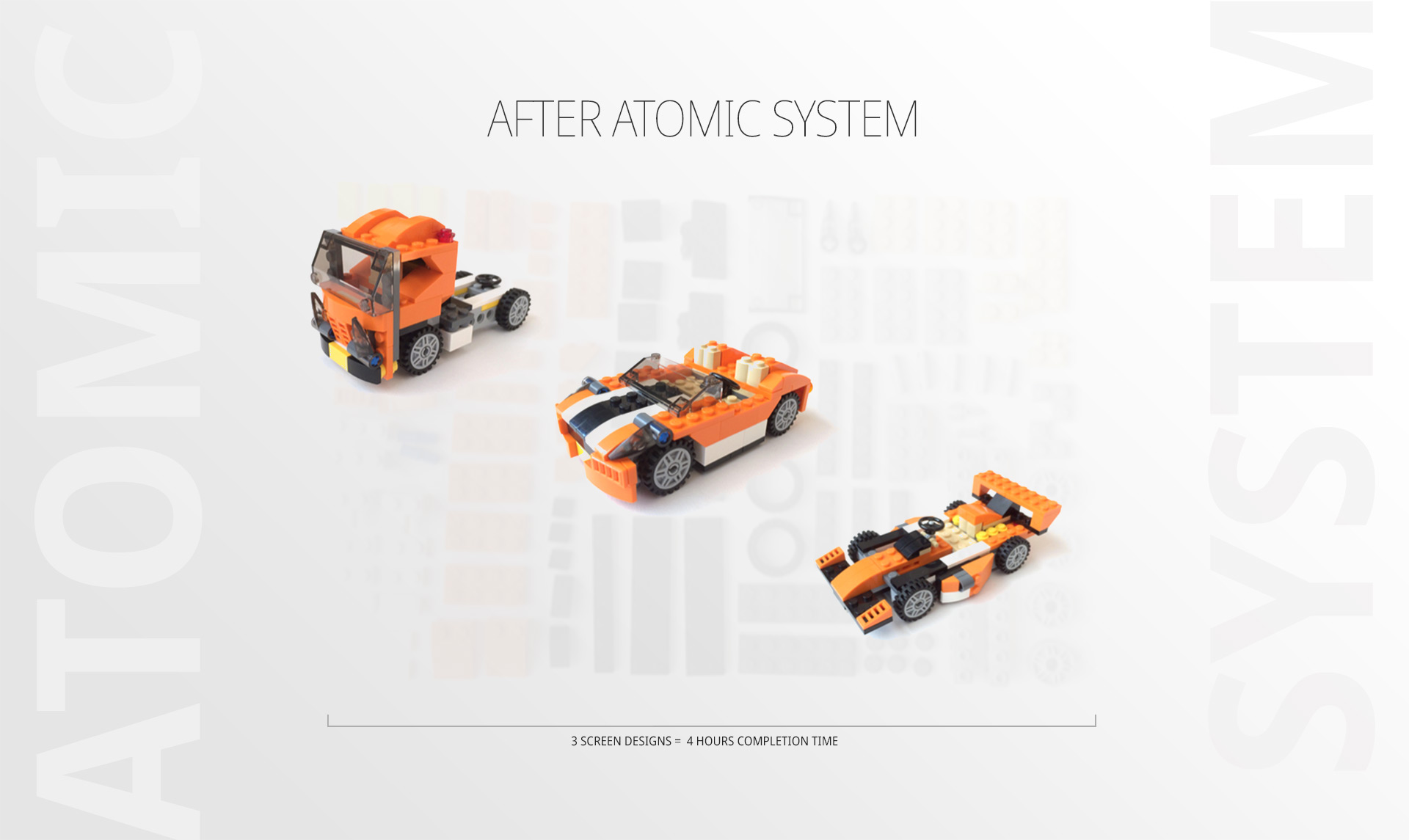
Once our internal audit was complete, it left us with an idea of what components would be needed for the new branded system. The next step was to look for ideas from a non-industry perspective. This will help drive inspiration to come. This process included exploring digital interactions that might happen outside the lab. By having each different designer split up and explore on their own, we could document and explore different design and interaction techniques. From there, we would come back and share the learnings gathered. Using Miro, we voted on the best ideas to include in our new designs. Here is a peak into some of those areas of inspiration.
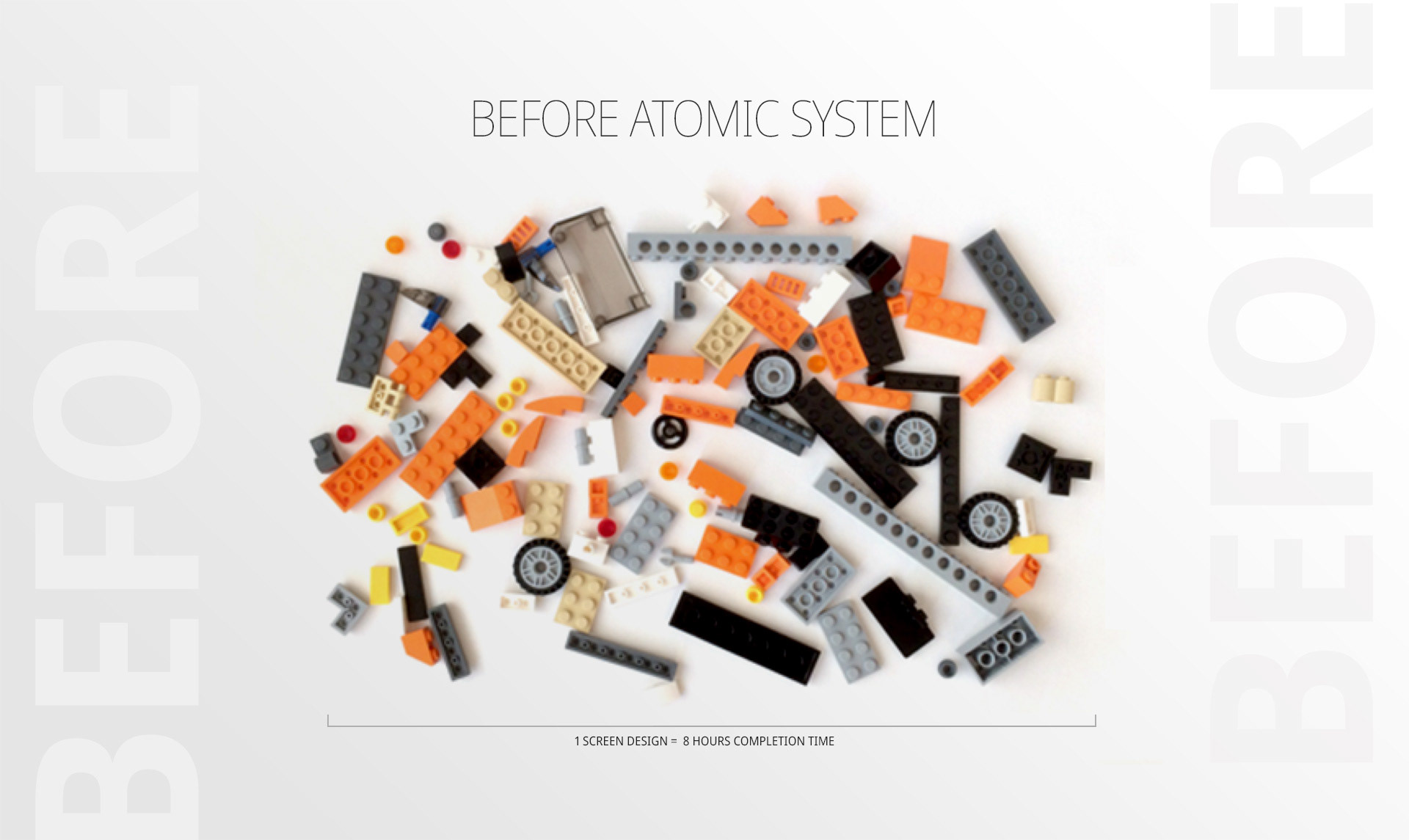
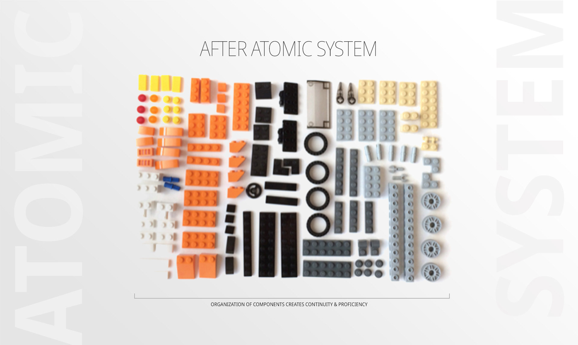
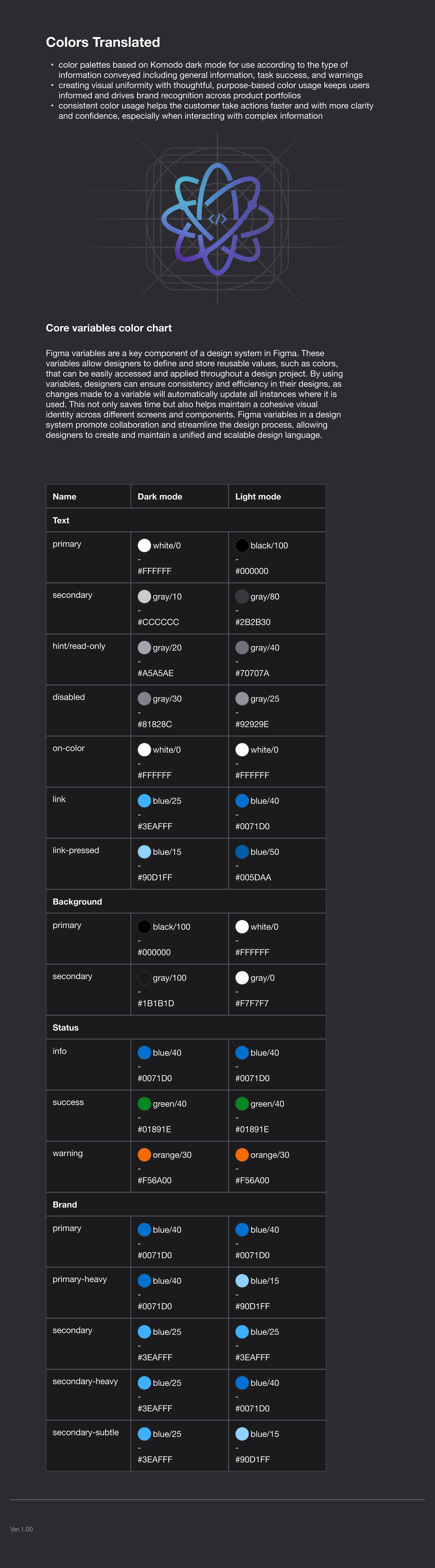
The Basics of a Design System
According to industry insights, there is a good return of investment to having a design system. According to Figma, "...when designers have access to a design system, they completed their objective 34% faster than without one."
The next step of this process requires us to have an understanding of the basics of a design system. A comprehensive design system must have full end-to-end communication between the entire team (Product Managers, Designers, Developers, and User Researchers). The system should contain a whole gambit of essentials in order to fully leverage it's benefits. It should encompass all the design rules that are established; all the development rules; all the communication rules, and whatever other processes you take into account to launch product. But, at the center of it all, is the use of the atomic design system. So, lets see how that works:
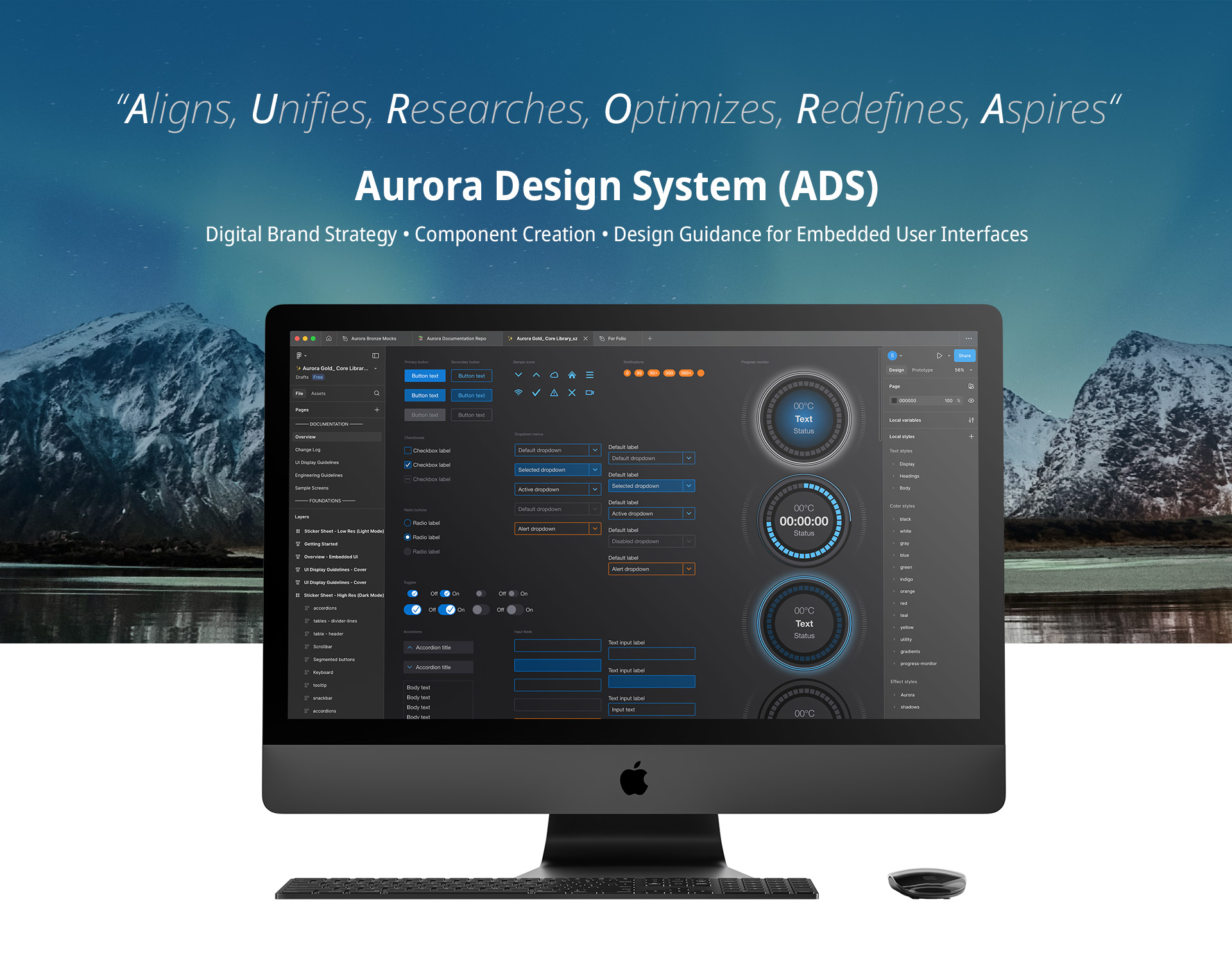
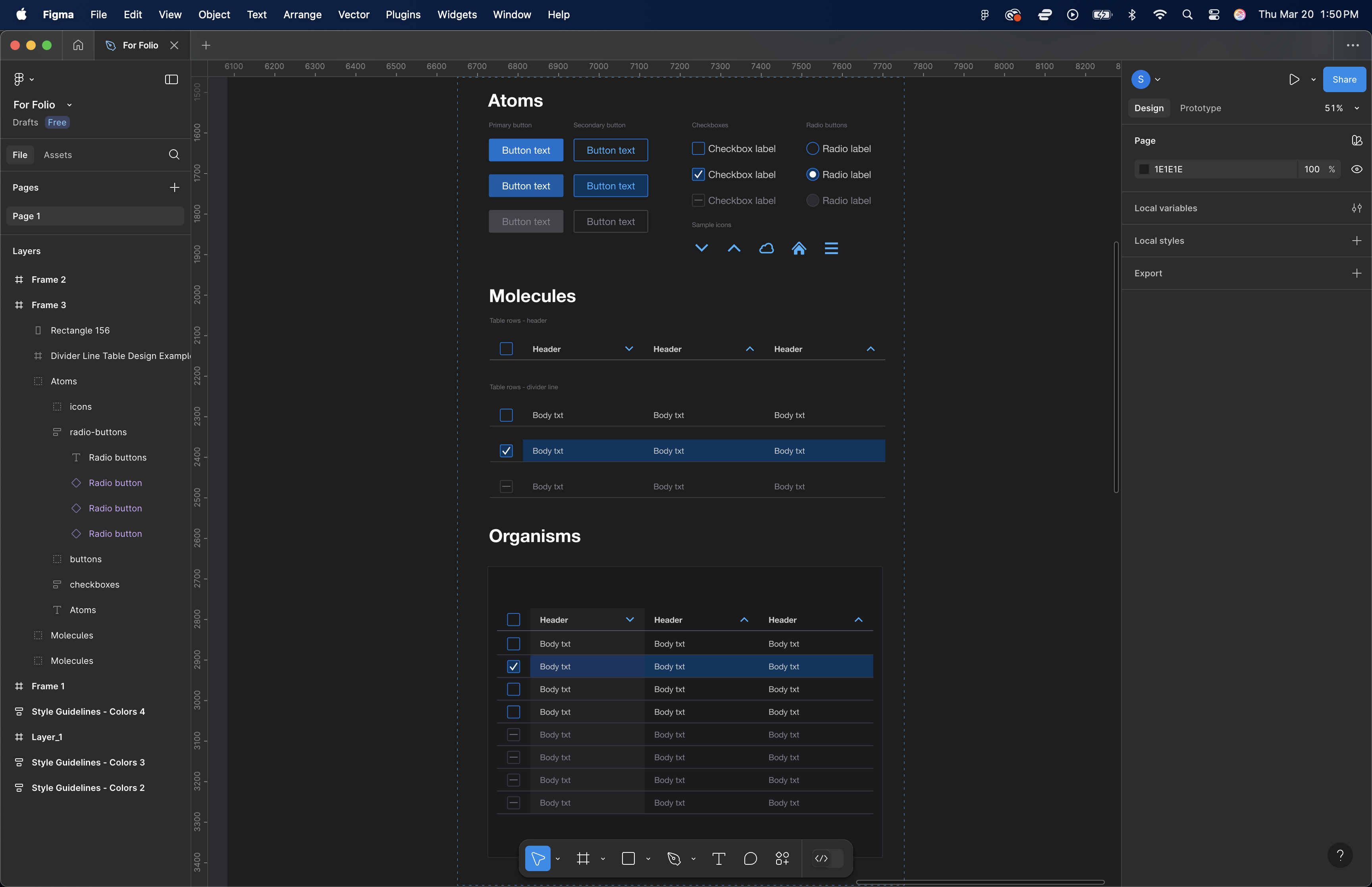
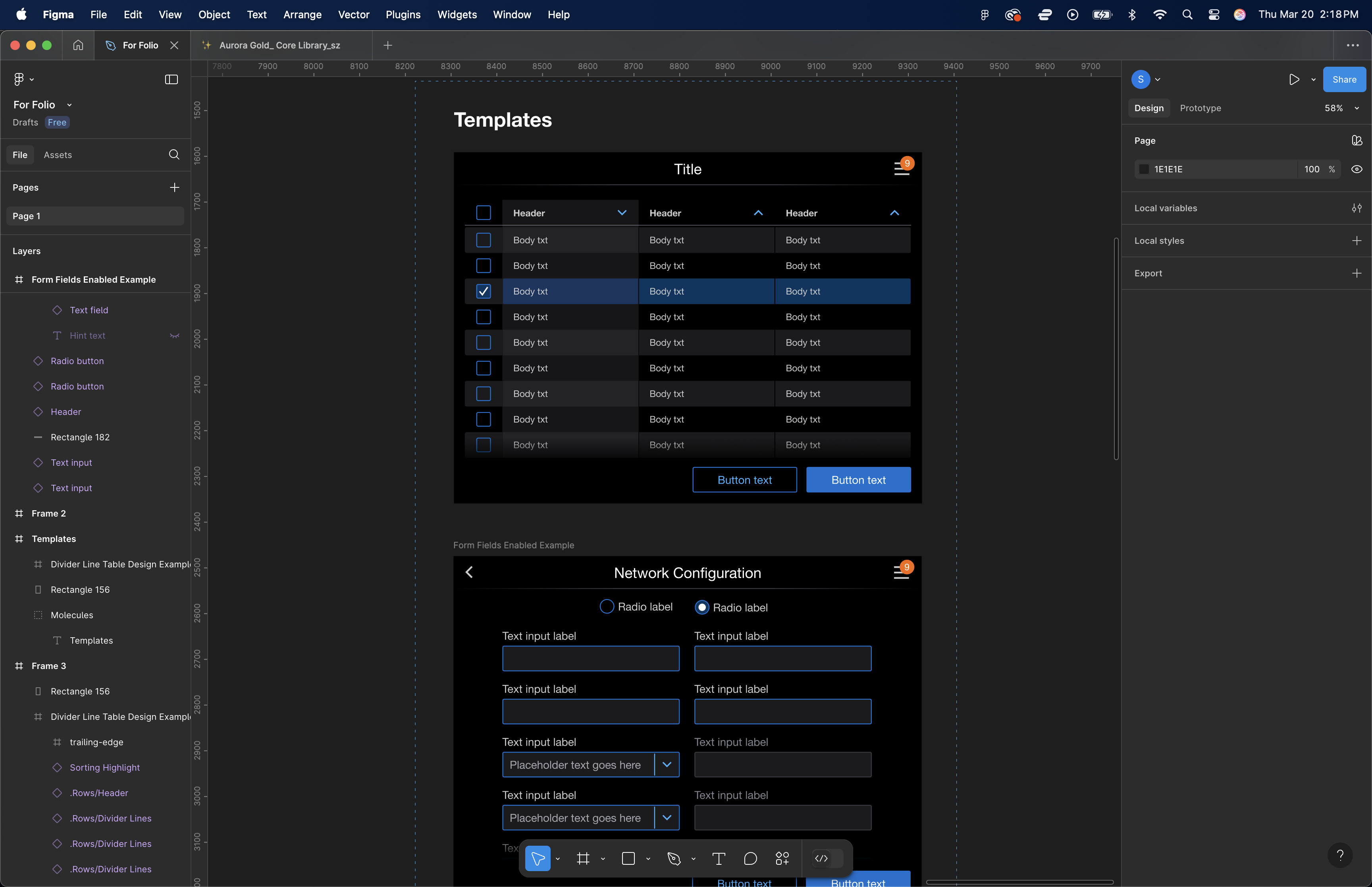
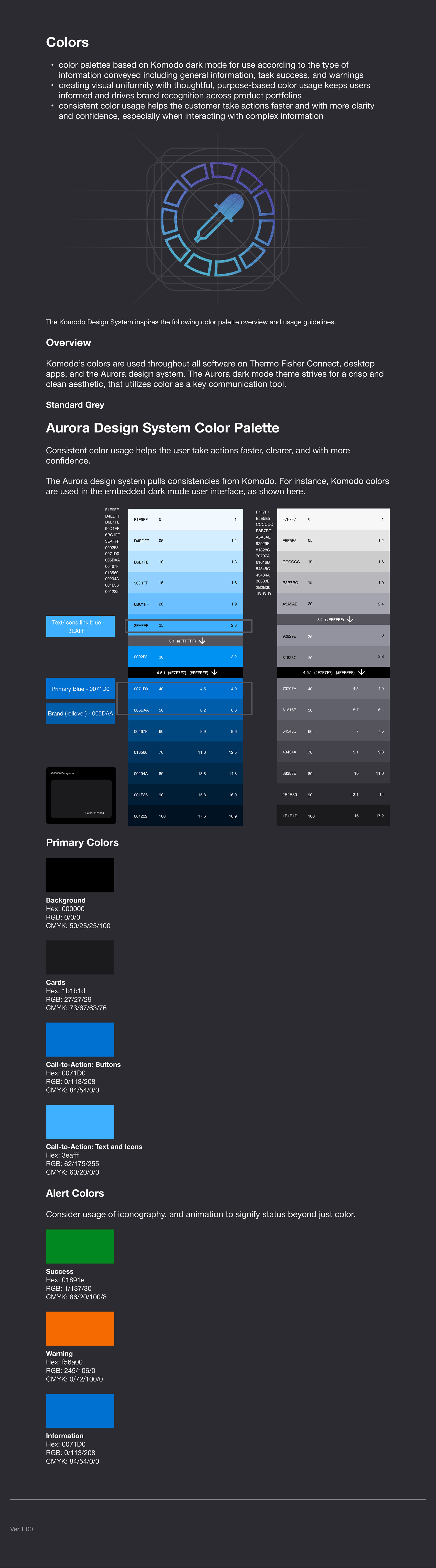
Aurora Use Case:
Here is a peek into how we set up the Atomic Design System on our end - starting with Atoms and working our way through Molecules and Organisms. Beyond this, we created page templates - full fledged examples of everything put together:
Making it Useful for Designers AND Developers
The key to making all this work is to include developers from the onset. We worked with a front-end developer in making use of all the tools Figma provided: including tokens, CSS classes, and code snippets directly within the Figma file.
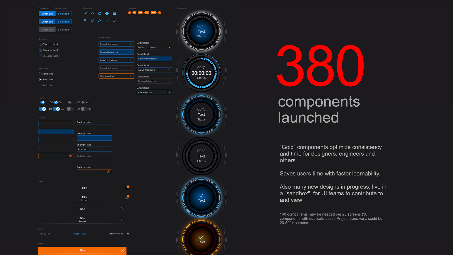
A key item to keep in mind is this system will expand and be used by multiple people. What helps us keep elements scalable is sticking to the atomic design principles - using nested components and using component properties to simplify variants. It is definitely an on-going learning experience to identify which components will be needed for "re-use" and which elements are only specific for "edge cases". But, it's also what makes it fun. Here is an example of what I mean by using component properties:
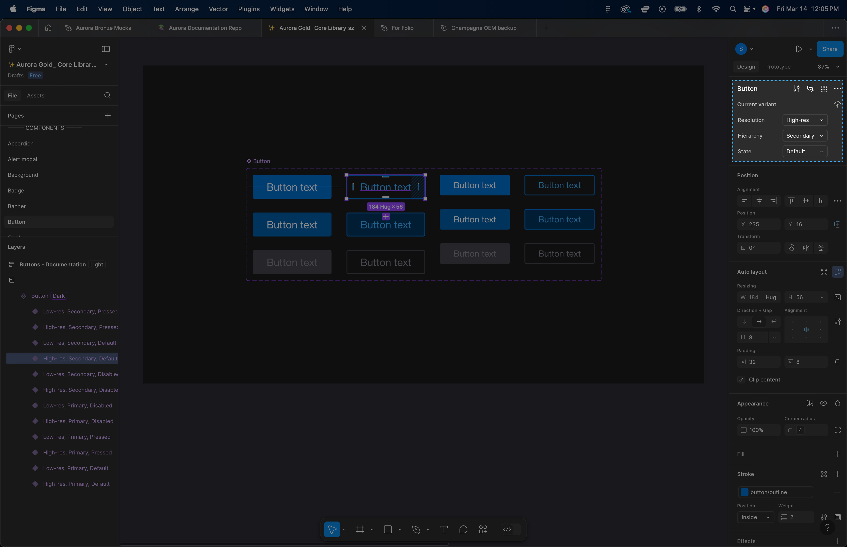
A button isn't just a button. In this case, it can be a hi-resolution or lo-resolution button. It can be a primary button or secondary button. And then there are the 3 states of buttons that need to be accounted for - default, pressed, or disabled (remember this is for touch screen interfaces, so there are no hovers). By building in these variants to a component, we are able to quickly identify what state is needed for any given screen design, in any part of the flow. On top of this, any changes made to a master component can cascade throughout a full design document, saving countless amounts of time in the process.
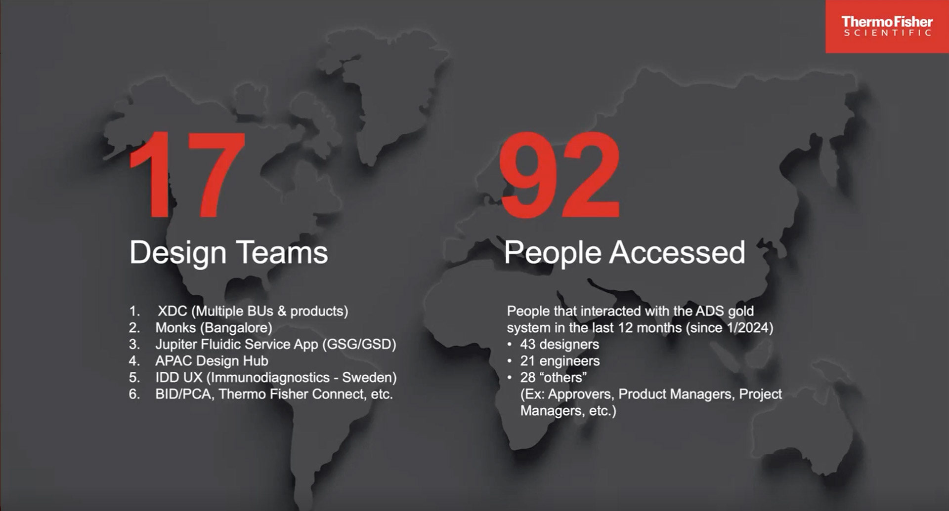
Where Are We, Today?
As with all design systems, it's a living, breathing structure. Our aim was to bring more consistency across our digital UI platforms, and so far, we've succeeded. As they say, it takes a village. But now that a system has rules in place, it's much easier for newer folks to quickly establish a footing when getting started. The foundational structures are there and now it's more of a matter of selectively adding new components when the need calls for it. As of January of 2024, we had over 380 components launch. 17 design teams that span the world are currently using it, and over a hundred people have accessed and interacted with it.