The Product Team
--------------------------------------------
--------------------------------------------
1 UX/UI Designer
-------------------------------------------
This was the first product launch using the new Aurora Design System (ADS).
Project duration: 6 months
Project duration: 6 months
Overview
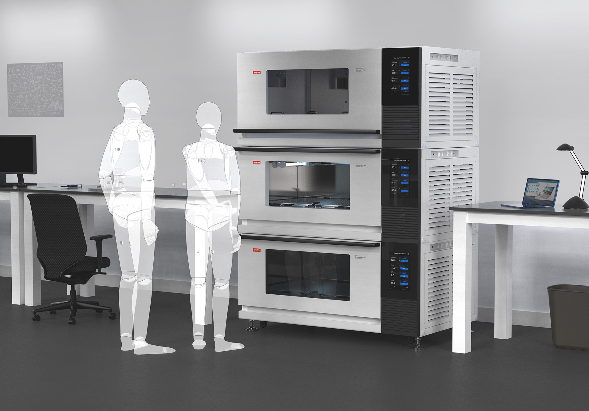
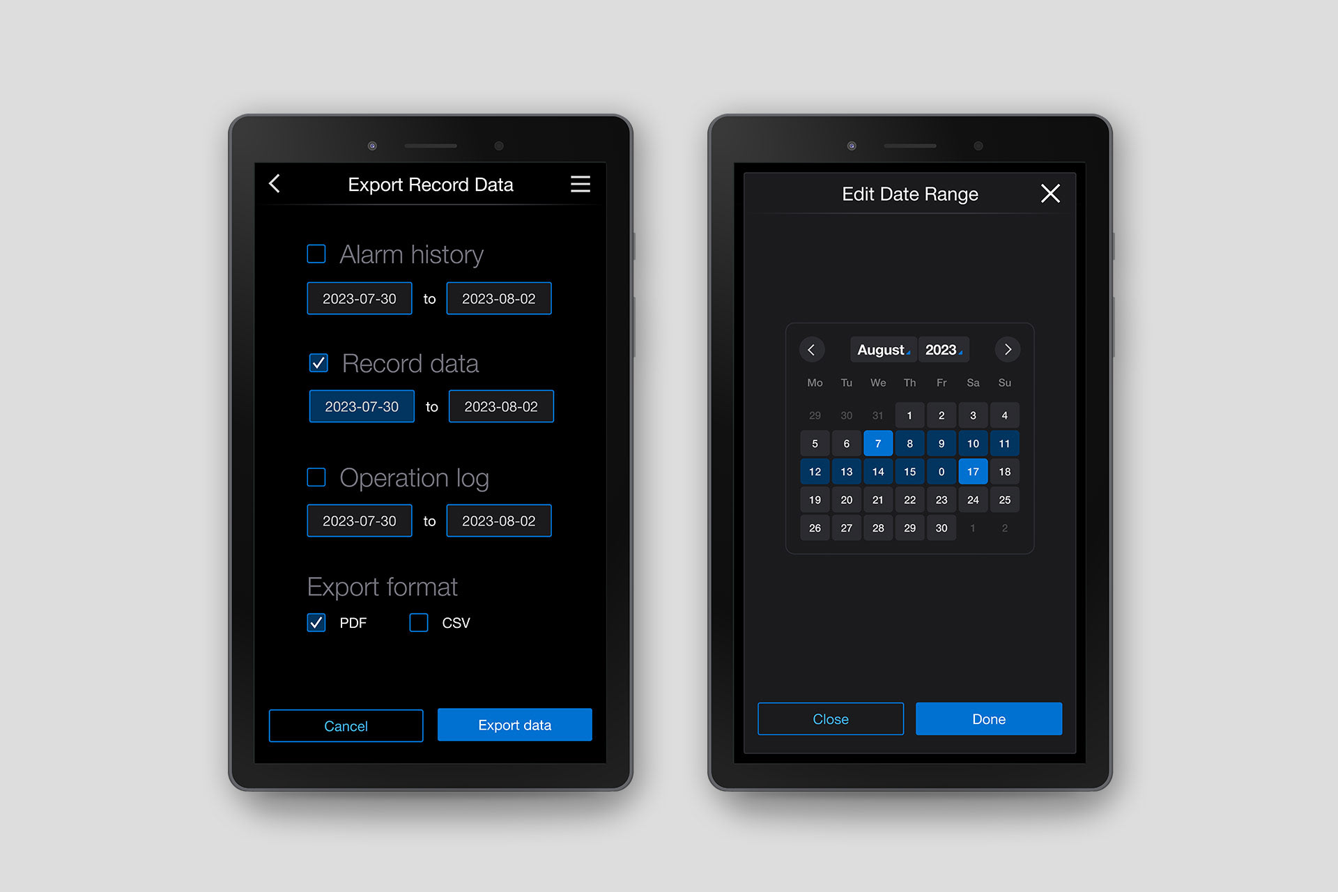
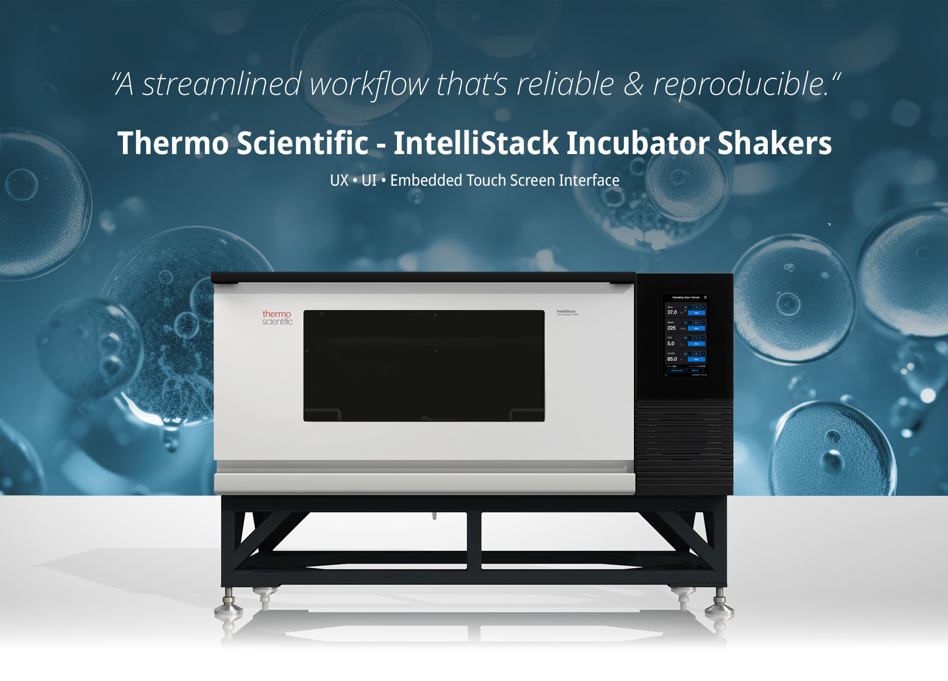
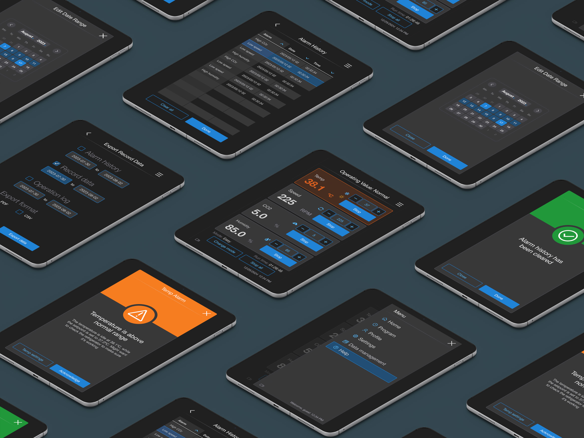
Update Thermo Scientific's Incubator Shakers with the updated Aurora Design System. This project would help establish a foundation (components) for future projects to come.
The Challenge
This seems like a straight forward ask, but there was a catch, of course - Can we get it done in half the amount of time it usually takes? Having such a tight launch window, this was the perfect opportunity to use our new design system to show what it was meant to do - cut down on delivery time. A minimum task would be to quickly change the color, fonts, and icons, to the old UI, but I knew we could push it further, so I set out to evaluate the current user flows and identify changes that could significantly improve task completion rates, while solving for an even friendlier user experience.
My Approach
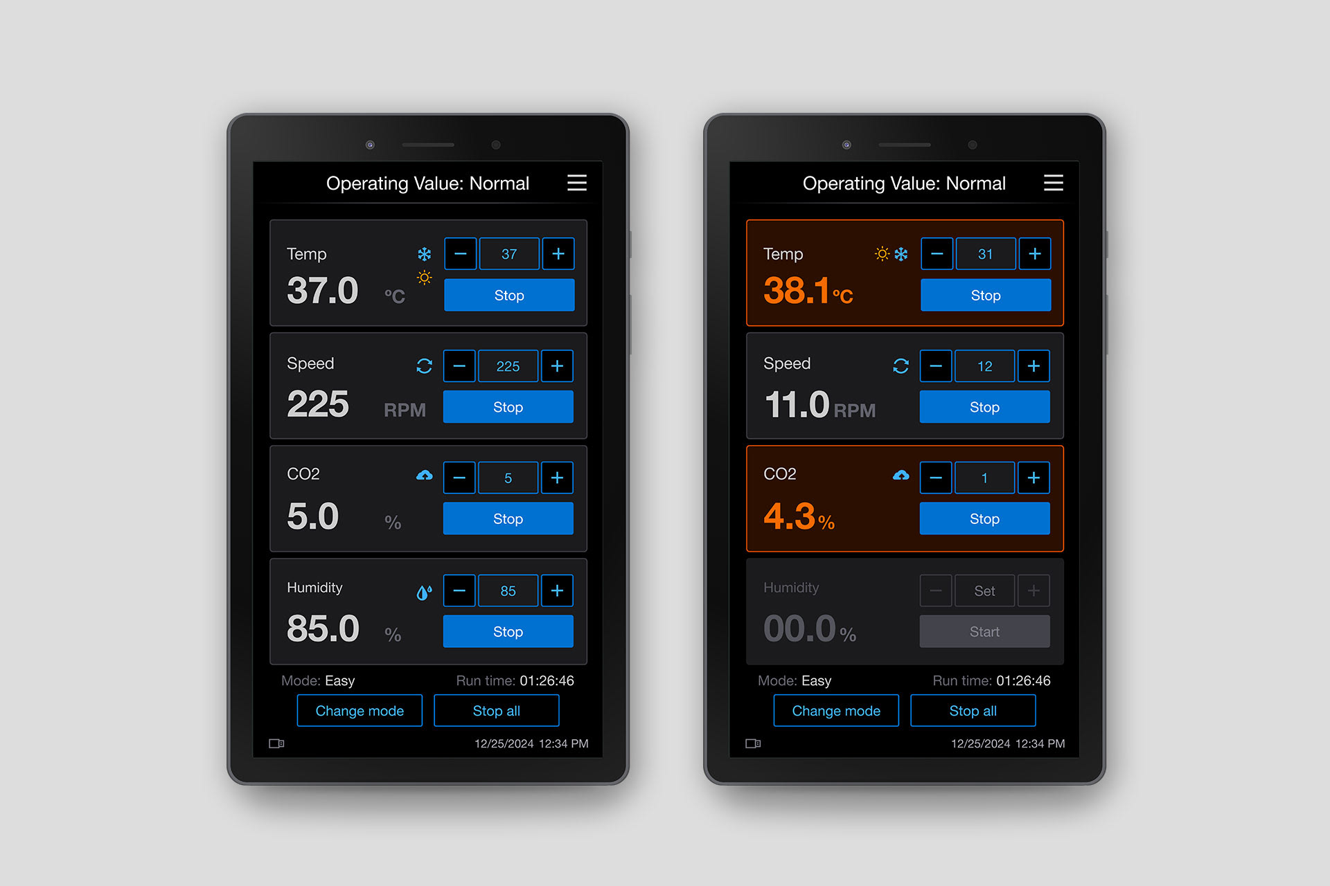
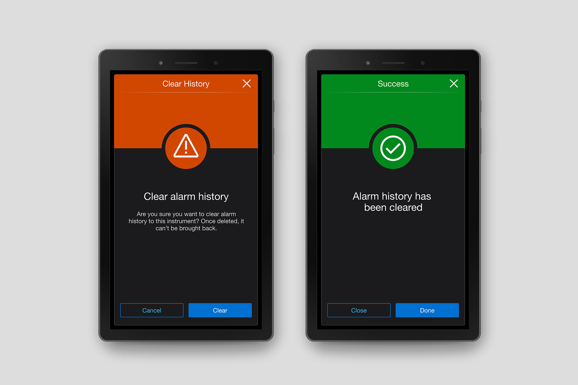
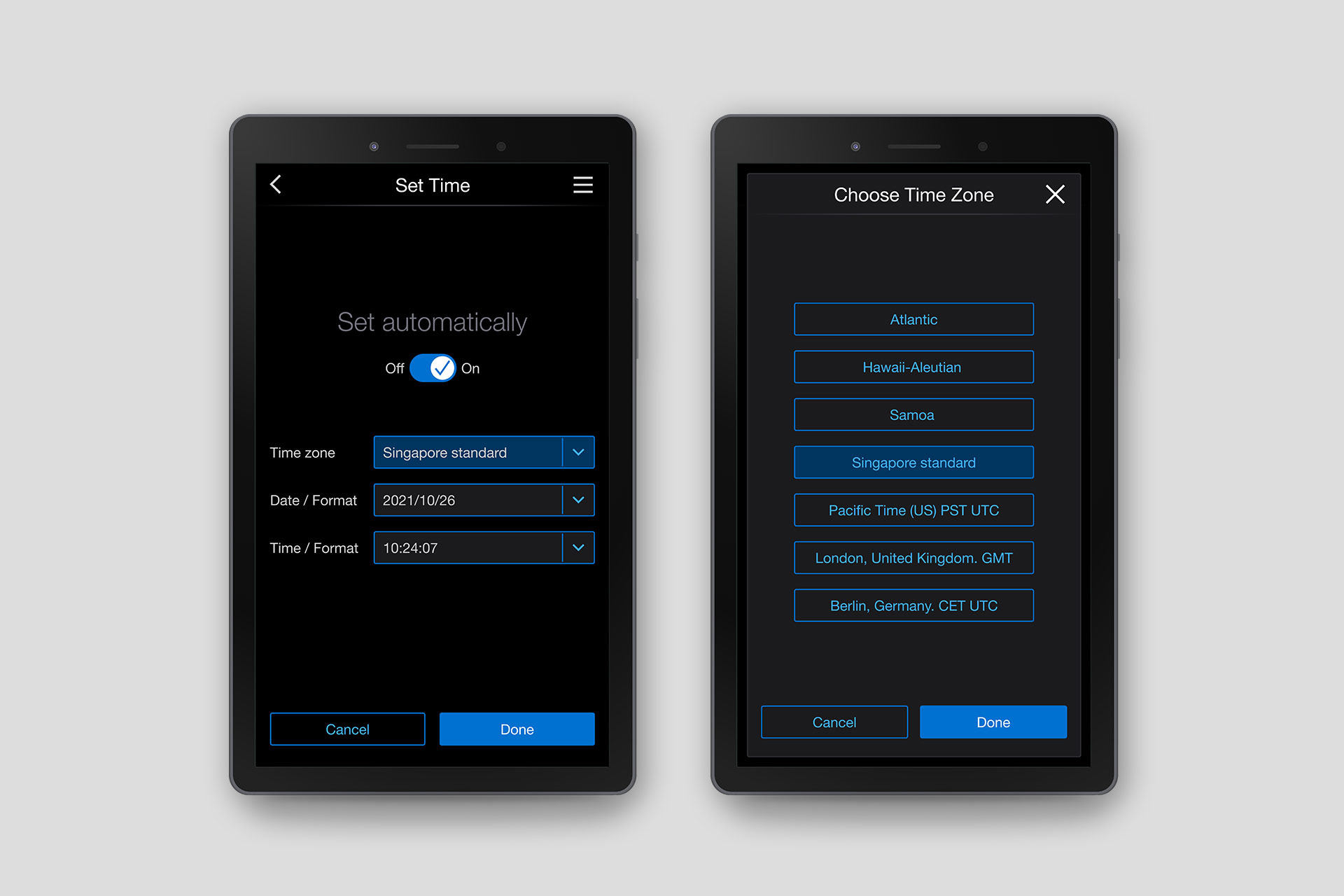
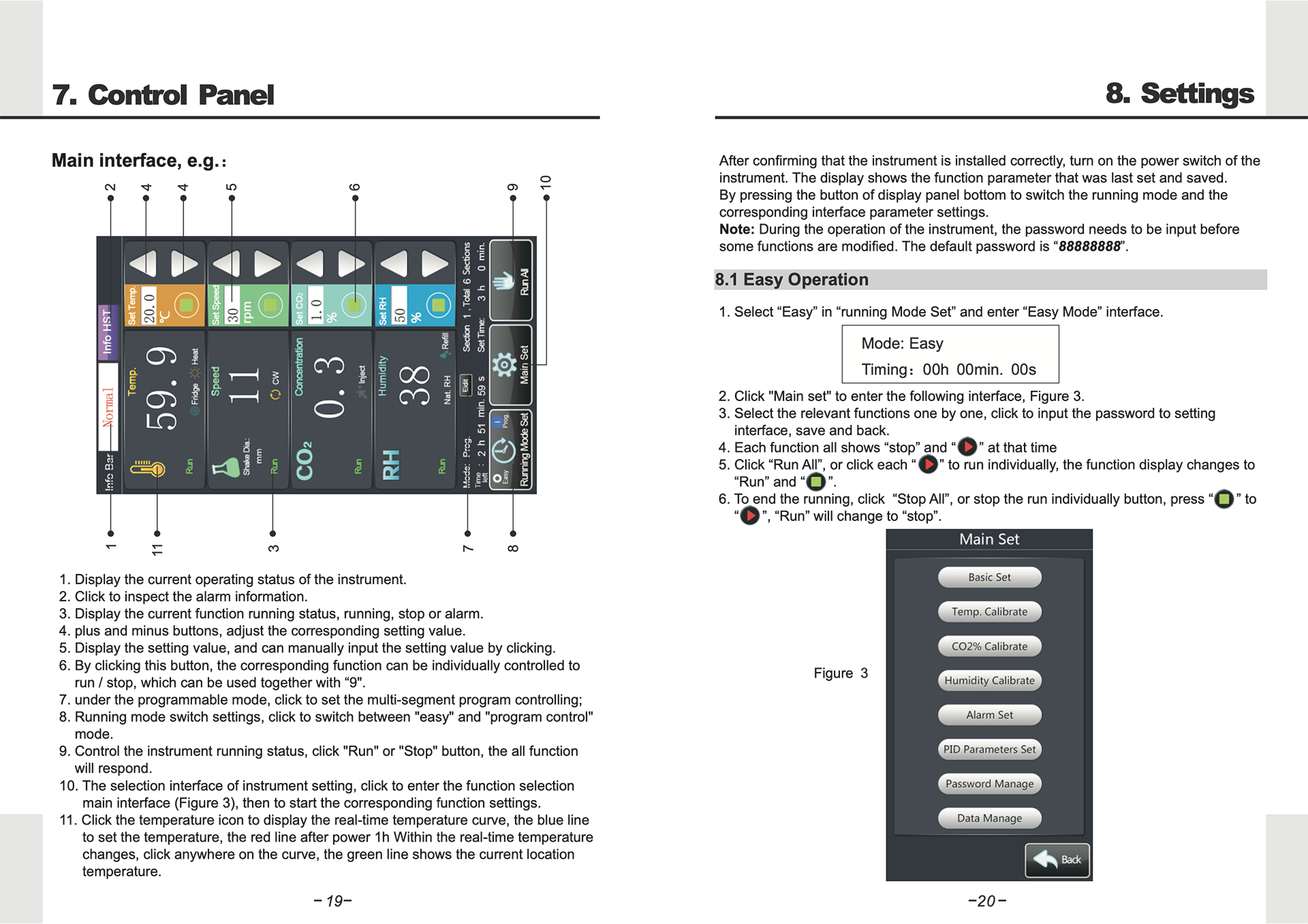
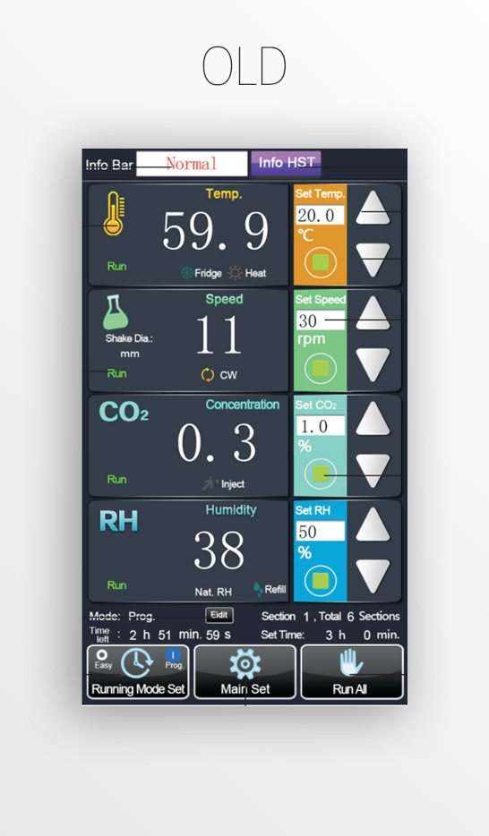
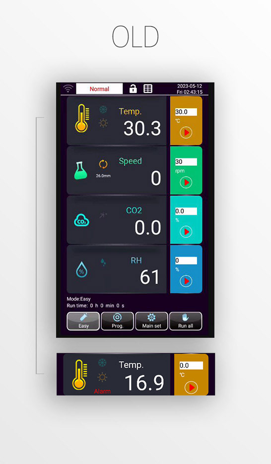
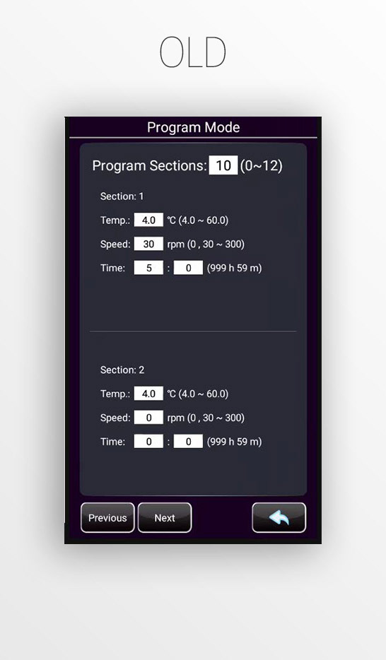
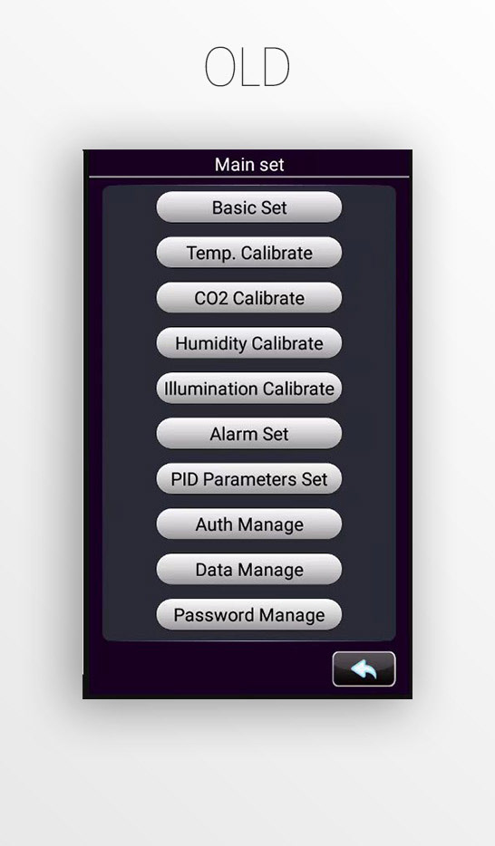
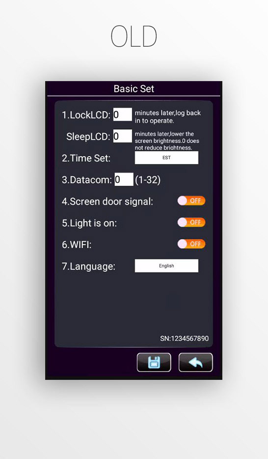
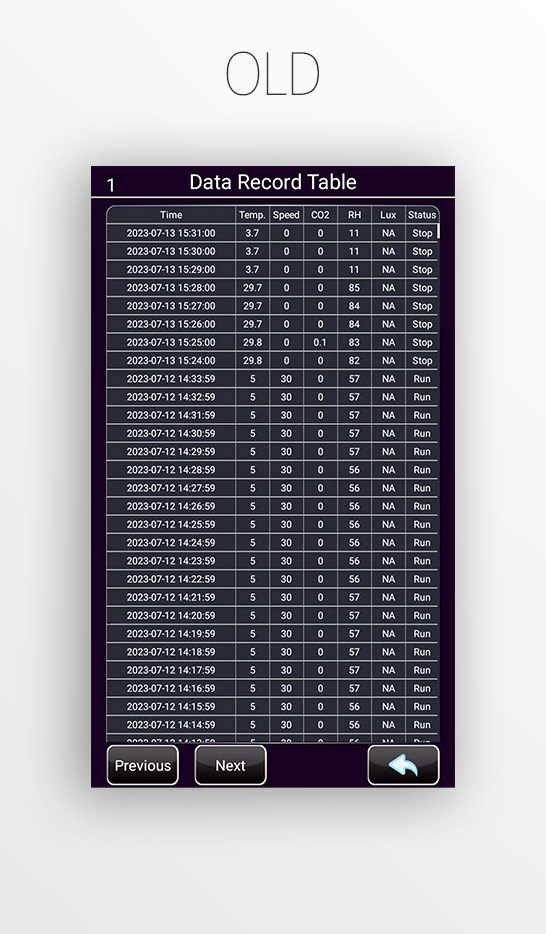
With such a tight timeline, my first priority was understanding the instrument's functionality and unique features. I typically start by asking for a walk through of the old UI (if it has it). If it doesn't, reviewing the user manual can provide valuable insight into its design, usability, and overall feel. This is what I did, here:
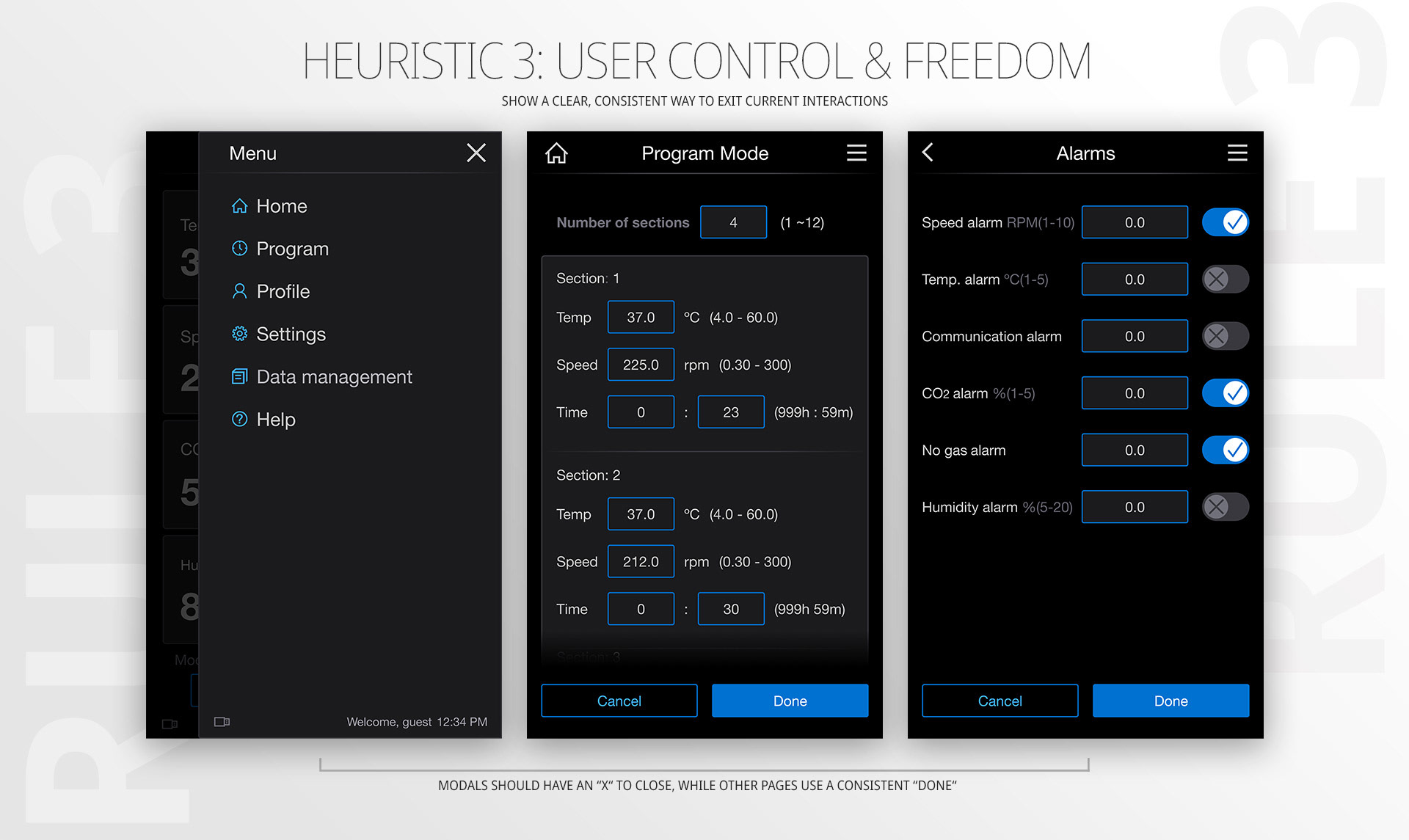
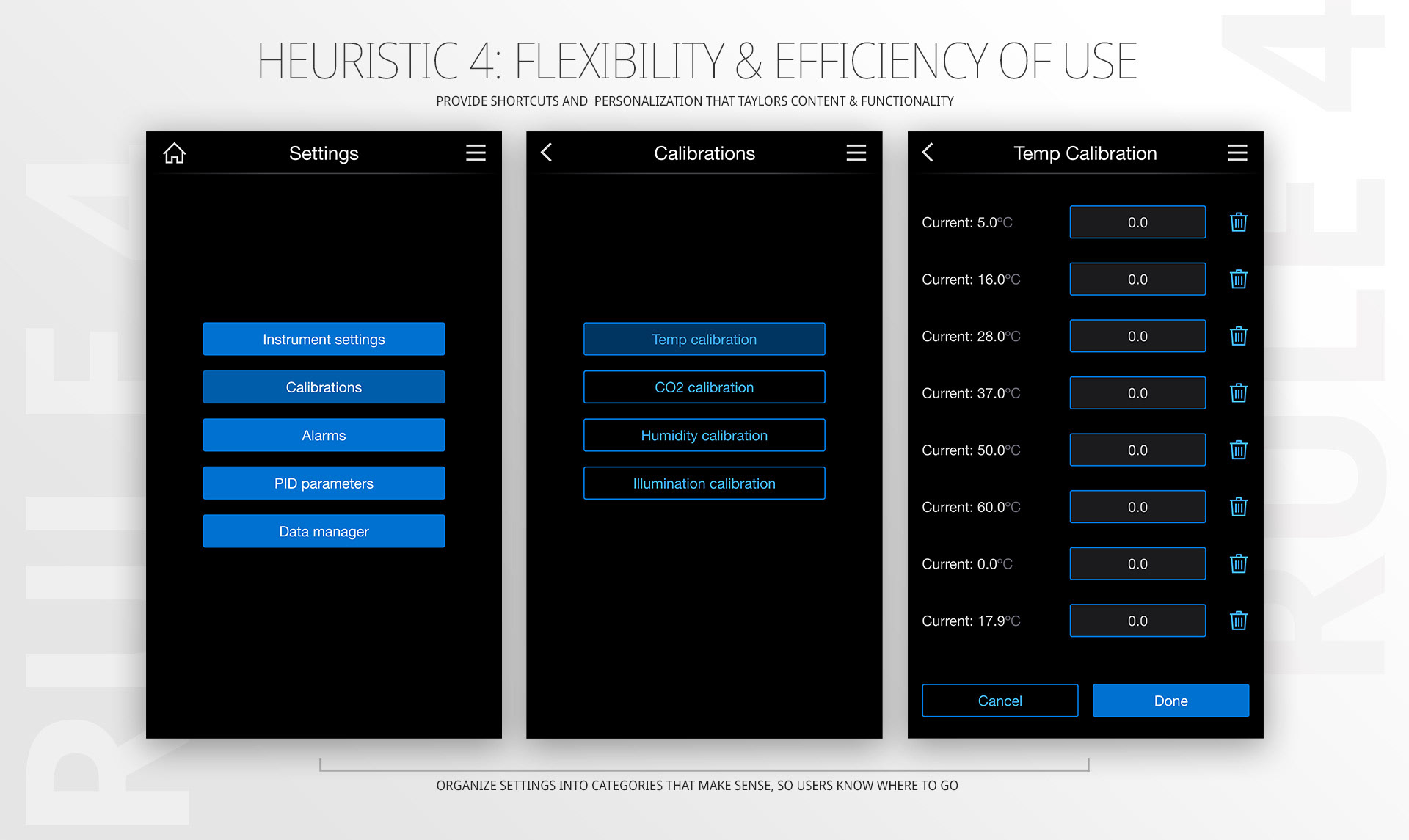
The True Magic Sauce: Heuristic Evaluations
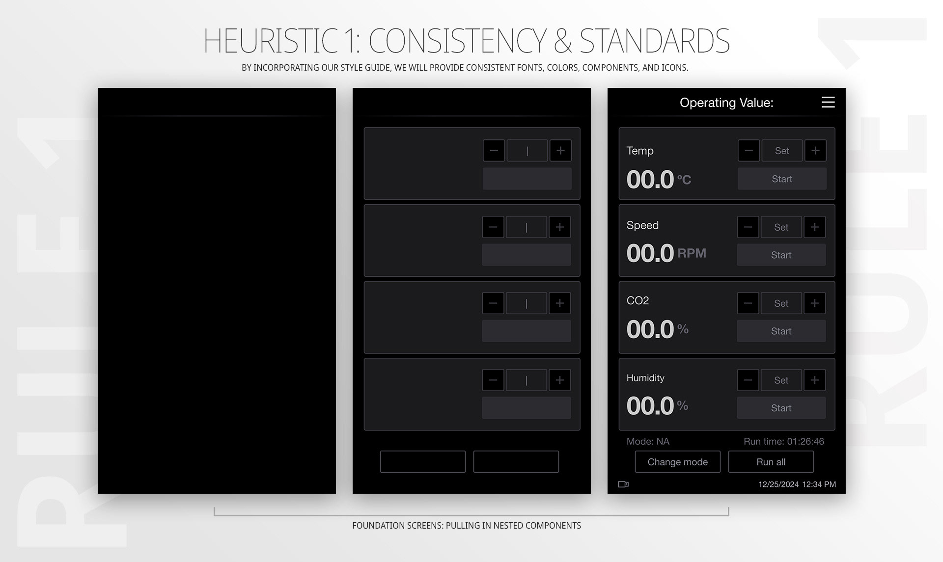
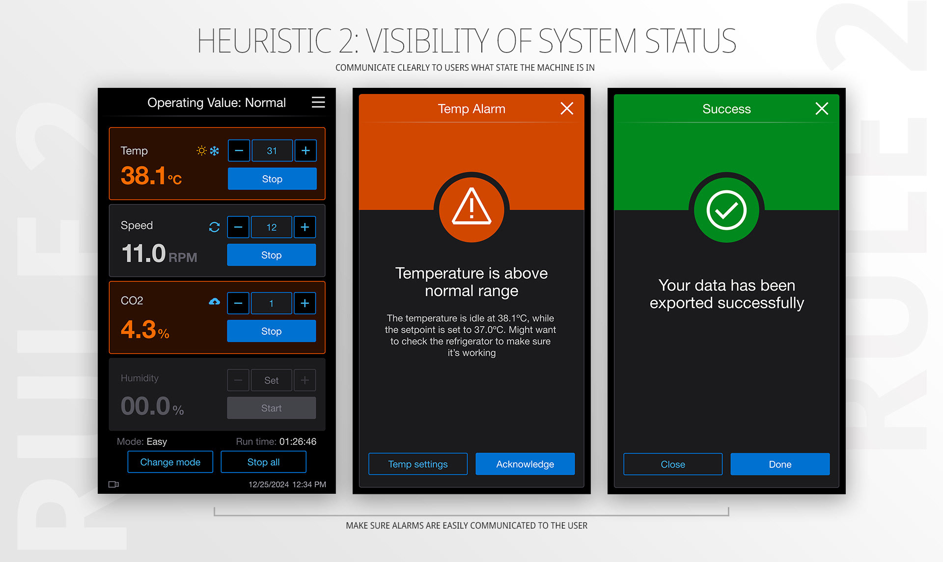
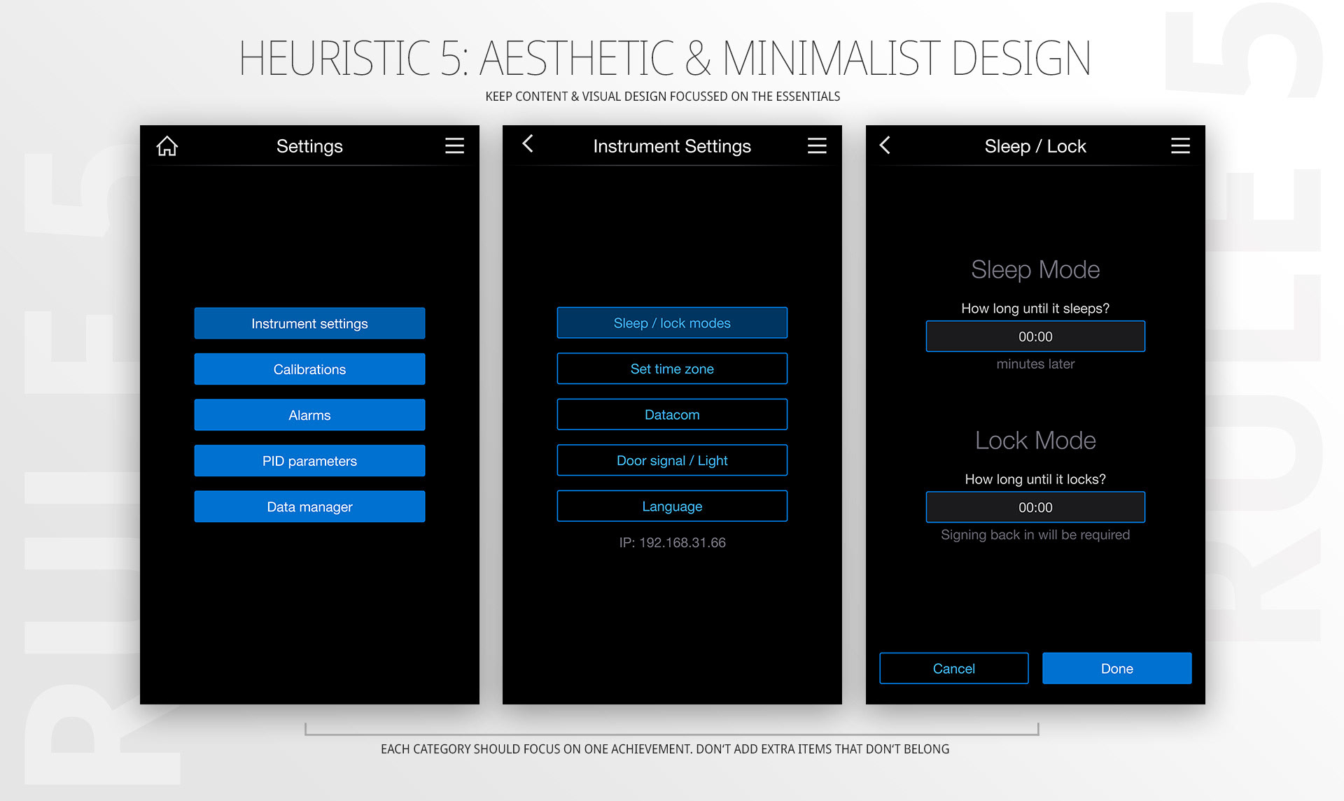
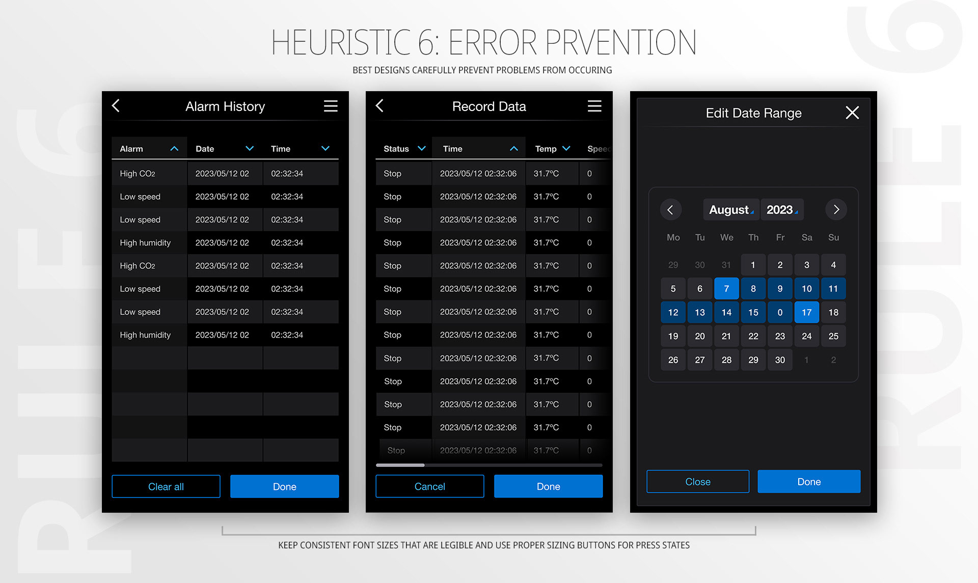
If everything was structured just right, I'd say my next tool of choice was to look into Jacob Neilson's usability heuristics. But that's not exactly how it went. To tell you the truth, I didn’t realize all I had done on this project until I put together a design review for the team, after launch. It suddenly dawned on me that I had internalized a few core "heuristic principles", made core improvements to workflows and architecture (by simplifying things) and polished it up for a successful launch. By scanning over the information architecture, I was quickly able to identify obstacles in the user experience. These inefficiencies often lead to areas of opportunities. As a designer, we strive to find areas ripe for simplification. For the design review, I was able to identify 6 rules that helped me improve certain flows and information architecture:
Overall, this project was a success, thanks to its efficiency and impact. I delivered an improved user experience alongside a refreshed visual design that excited the client. The launch was seamless, and as you will see in the product video below, everything just feels right. For more information, visit ThermoFisher.com/Intellistack.