The Team
--------------------------------------------
--------------------------------------------
1 UI Designer
1 UX Designer
1 Front end Engineer
1 Back end Engineer
-------------------------------------------
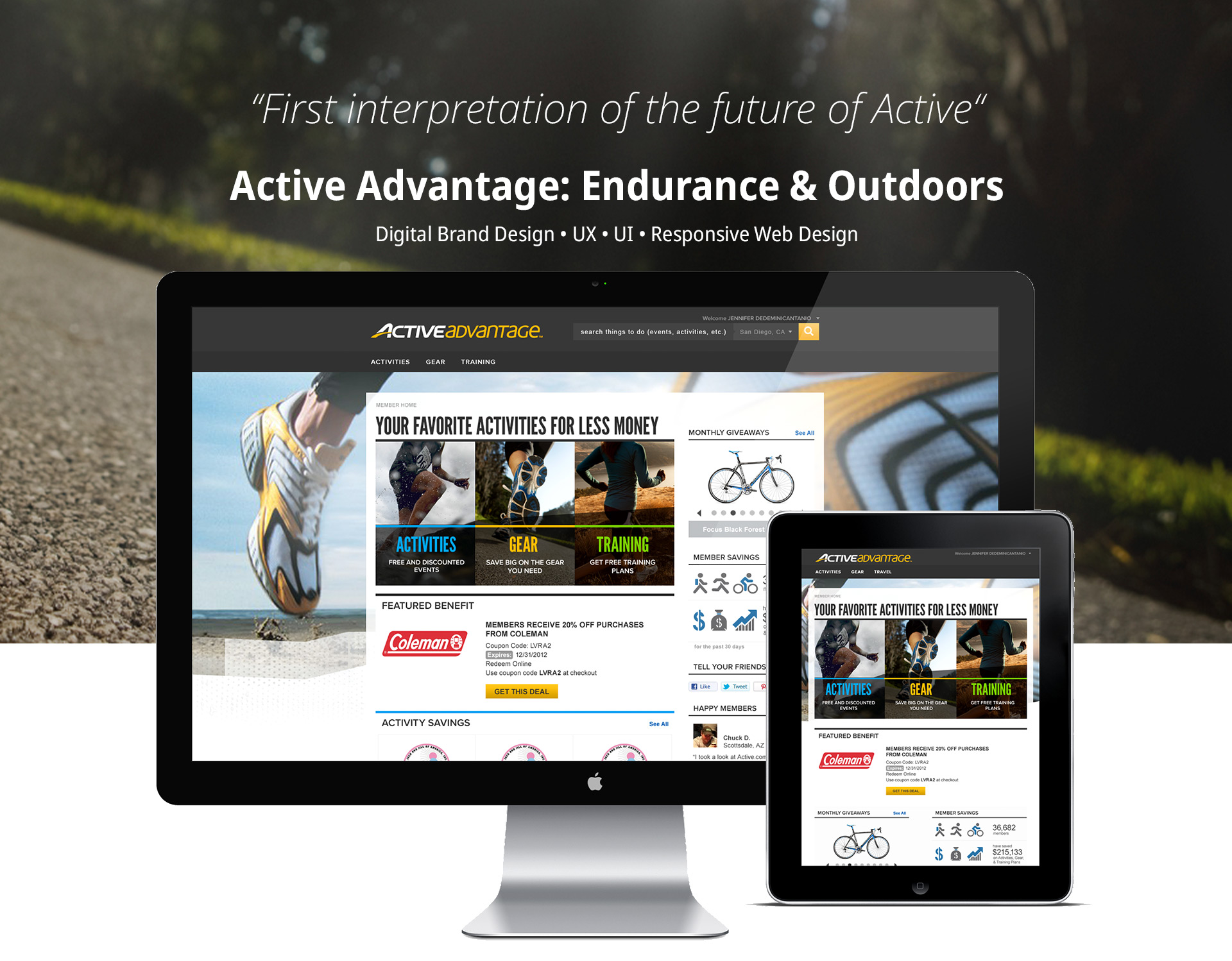
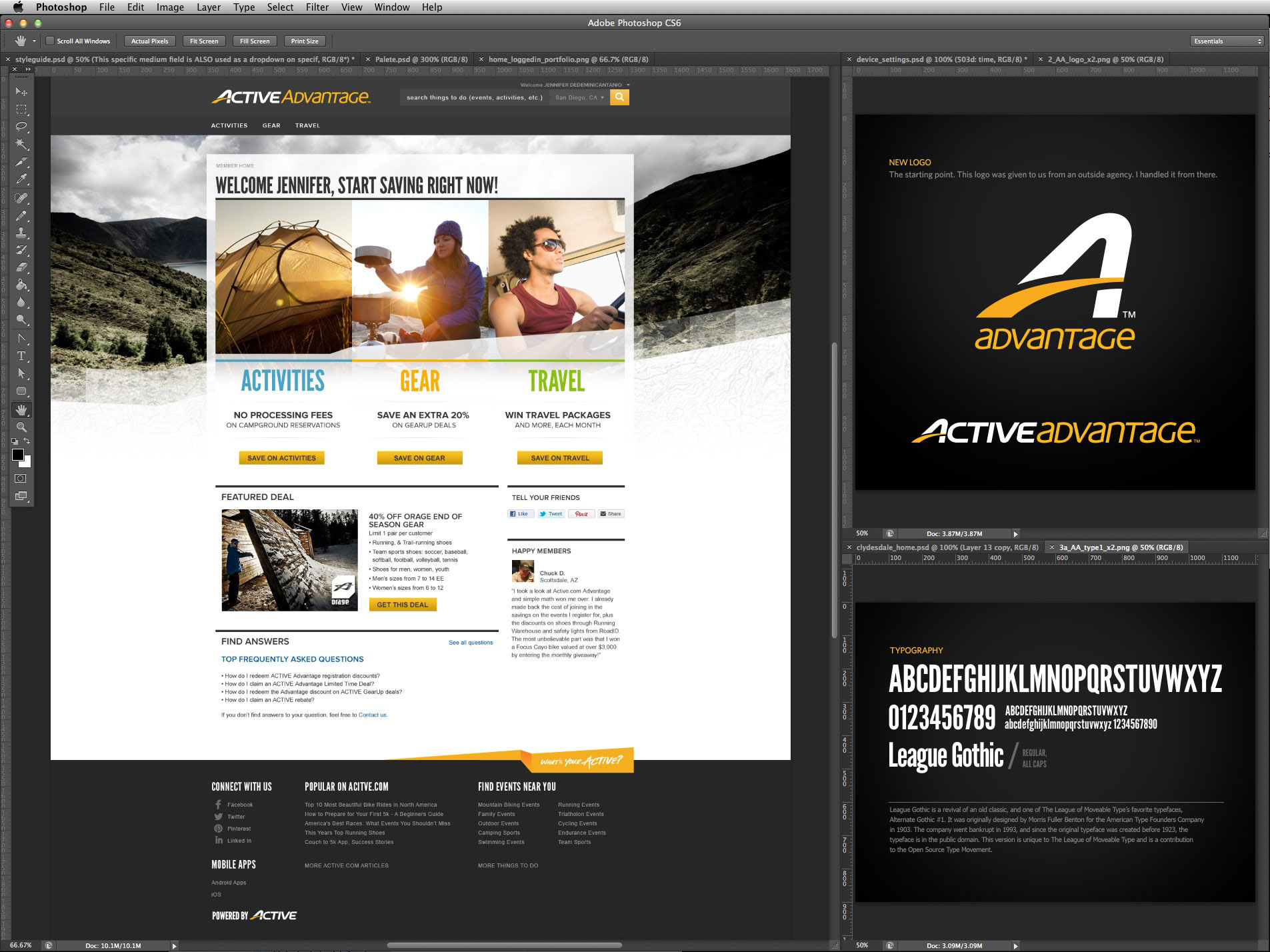
This was the first site launched using the new branded look and feel.
Project duration: 1 year
Project duration: 1 year
Overview
Active Advantage needed a re-design. At the same time, Active was looking to rebrand itself. An outside agency updated the logo. It was my job to create the first interpretation of a new look and feel for the website, which would eventually act as a template across all of Active's websites.
The Challenge
The goal was to push the company out of complacency. Visually, we want to connect with the athletes everywhere and show them we "get them". This site, specifically, focussed on giving athletes a new way to view and share current deals from the brands they love.
My Approach
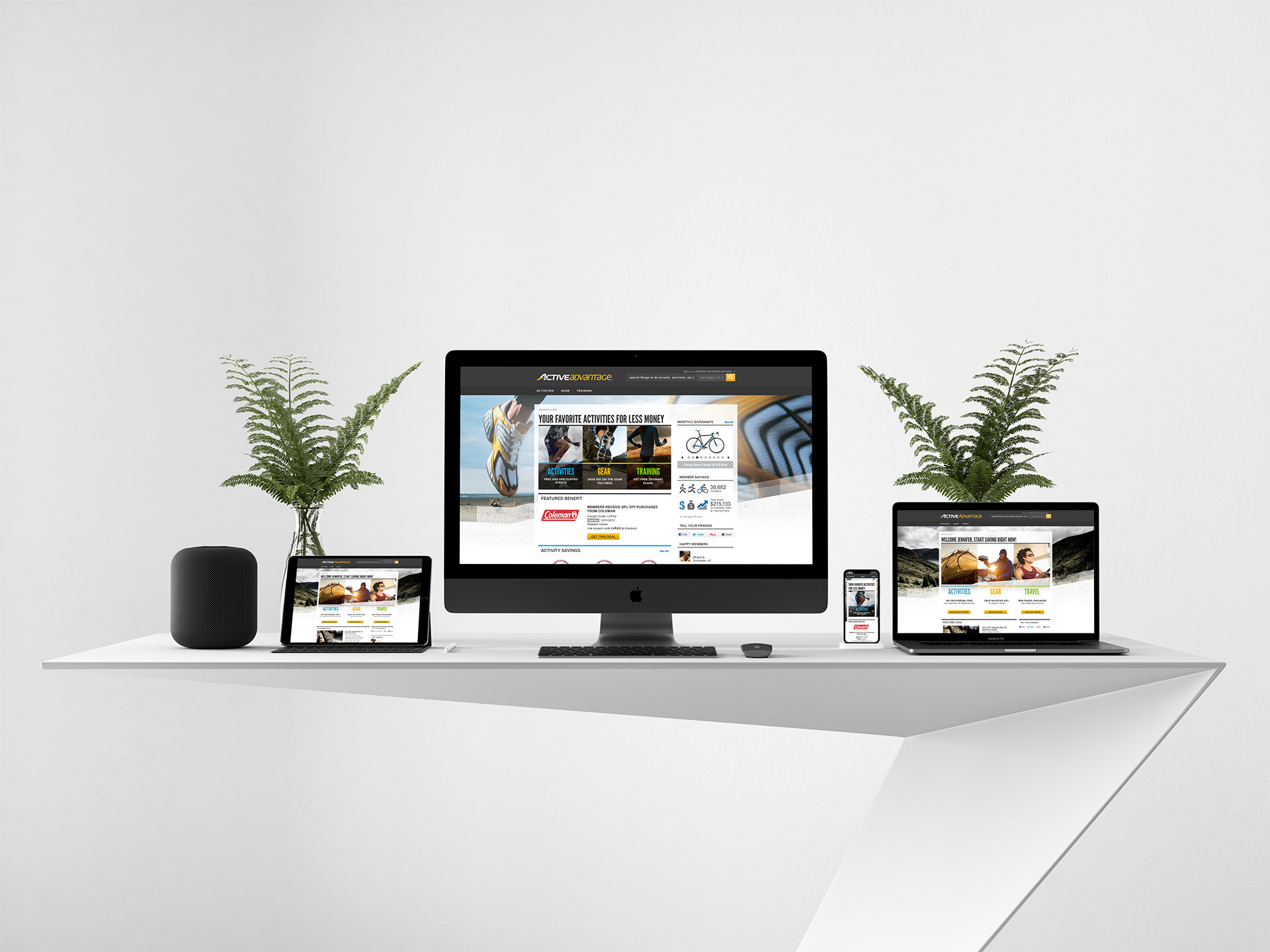
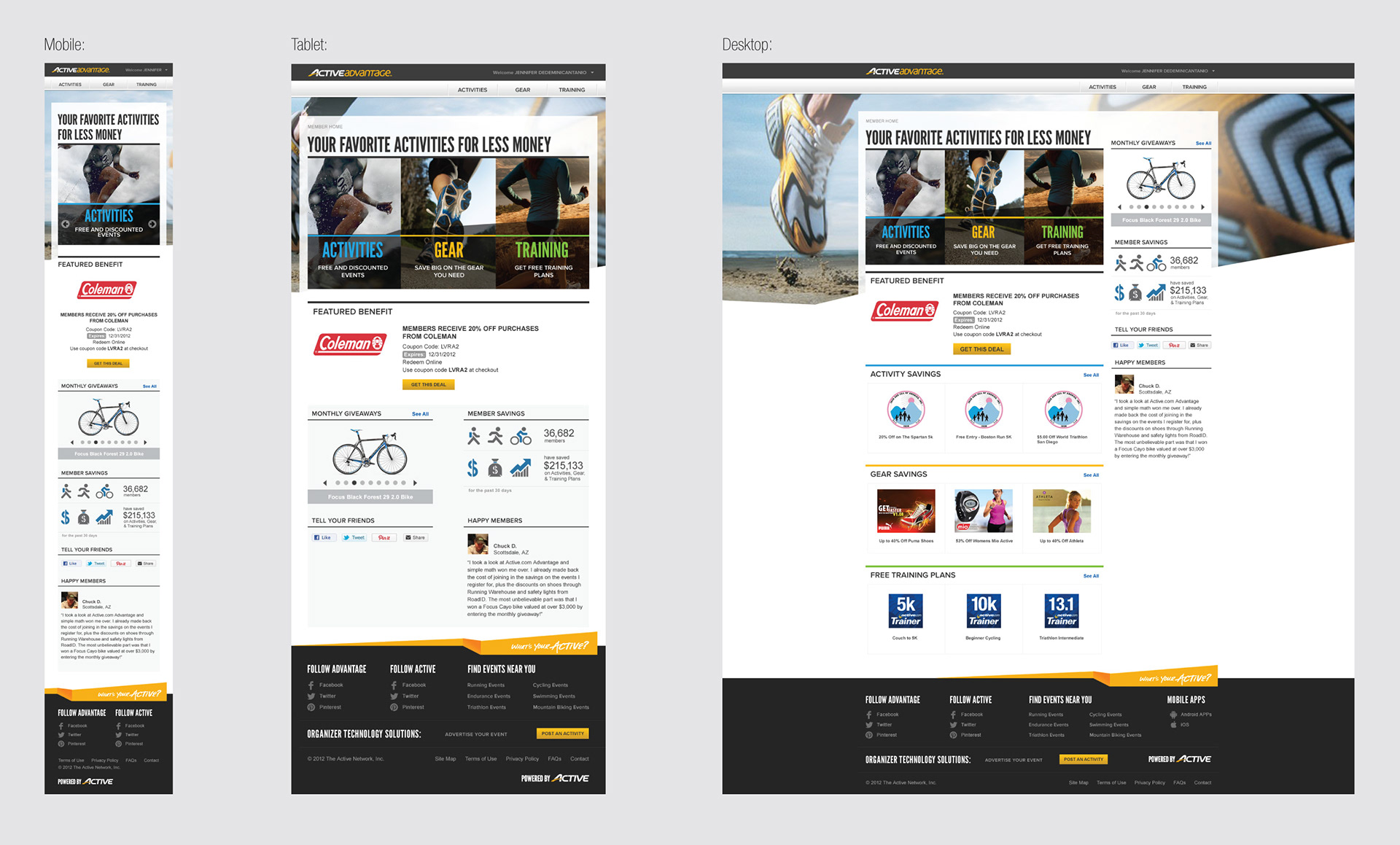
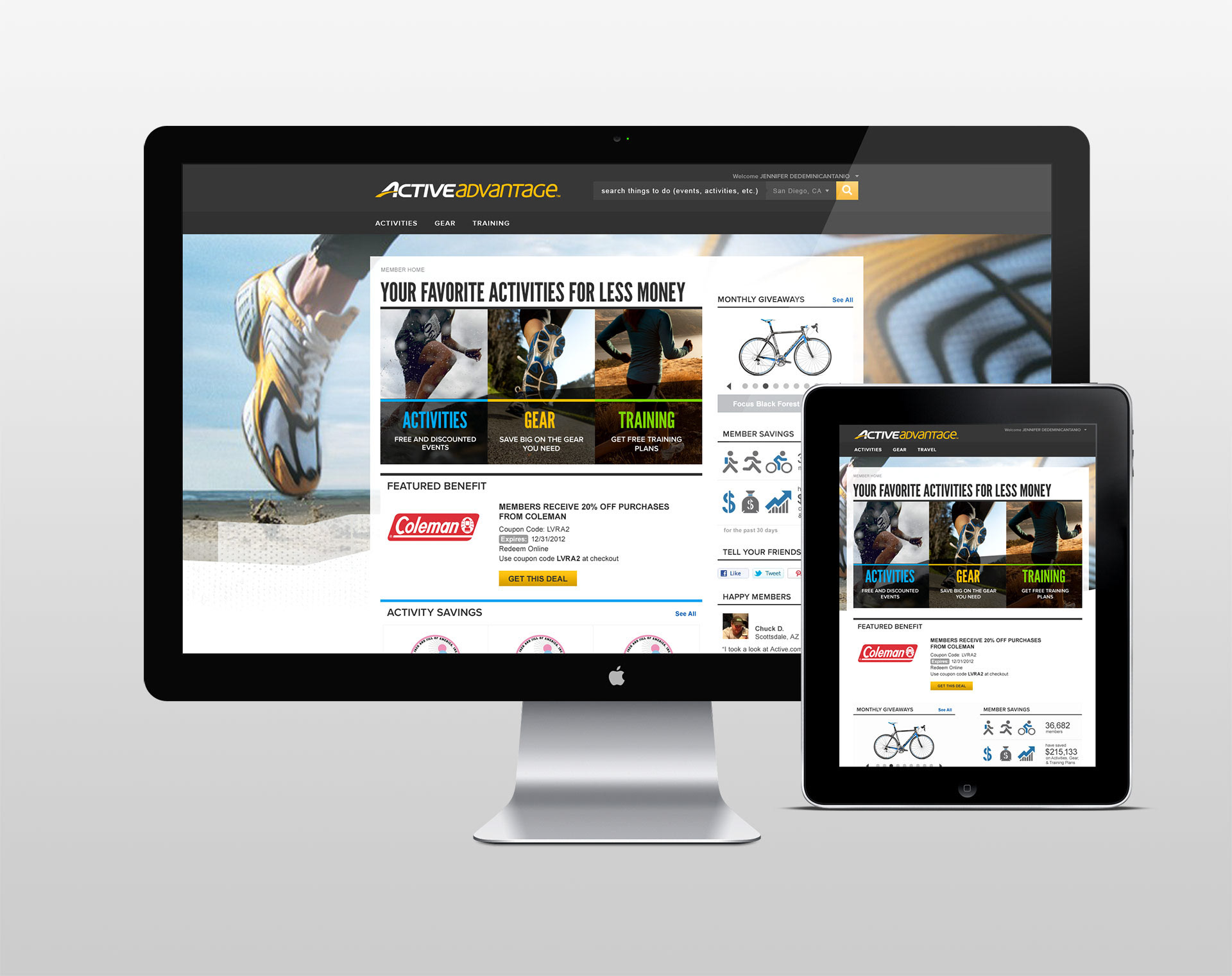
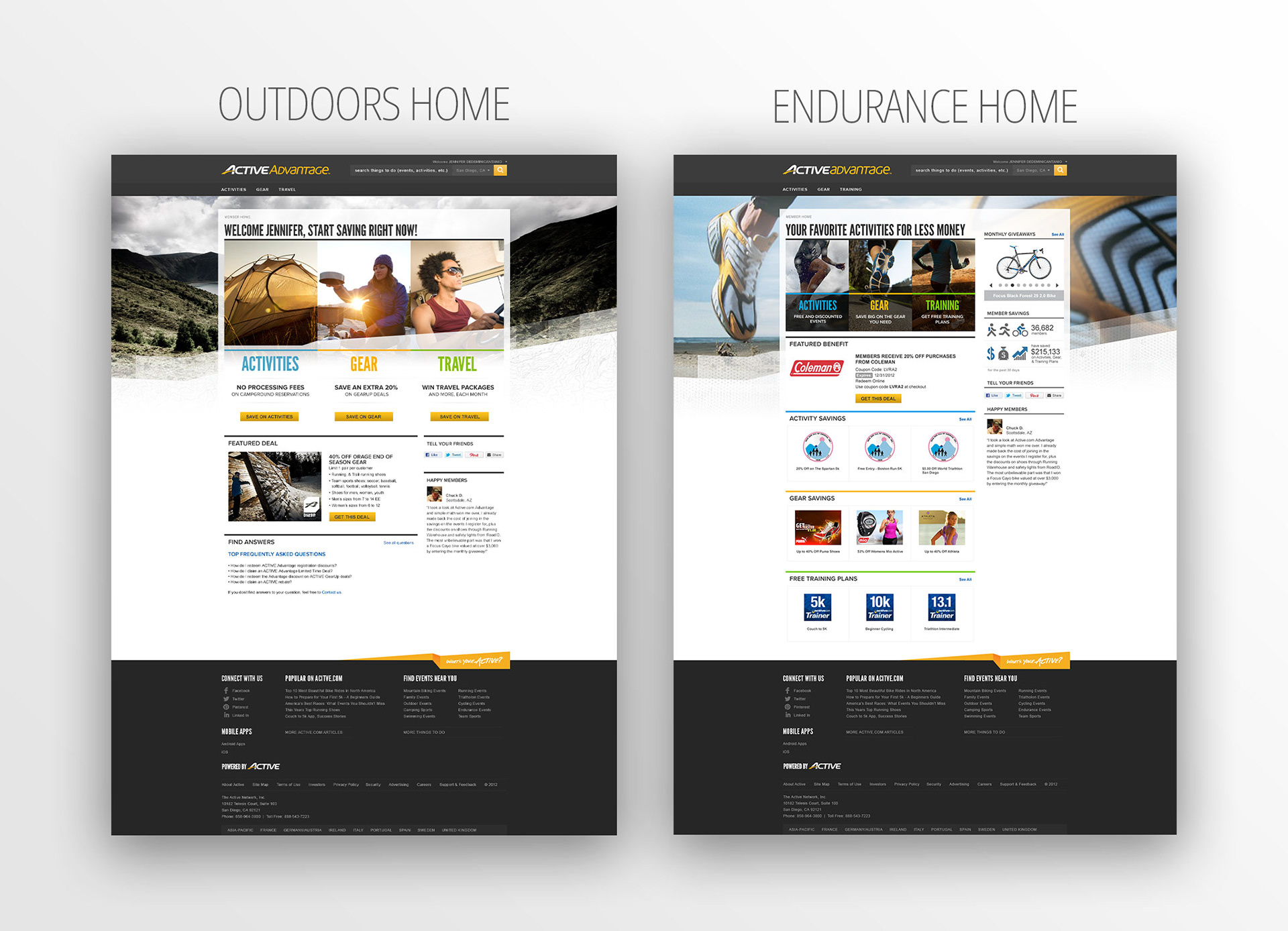
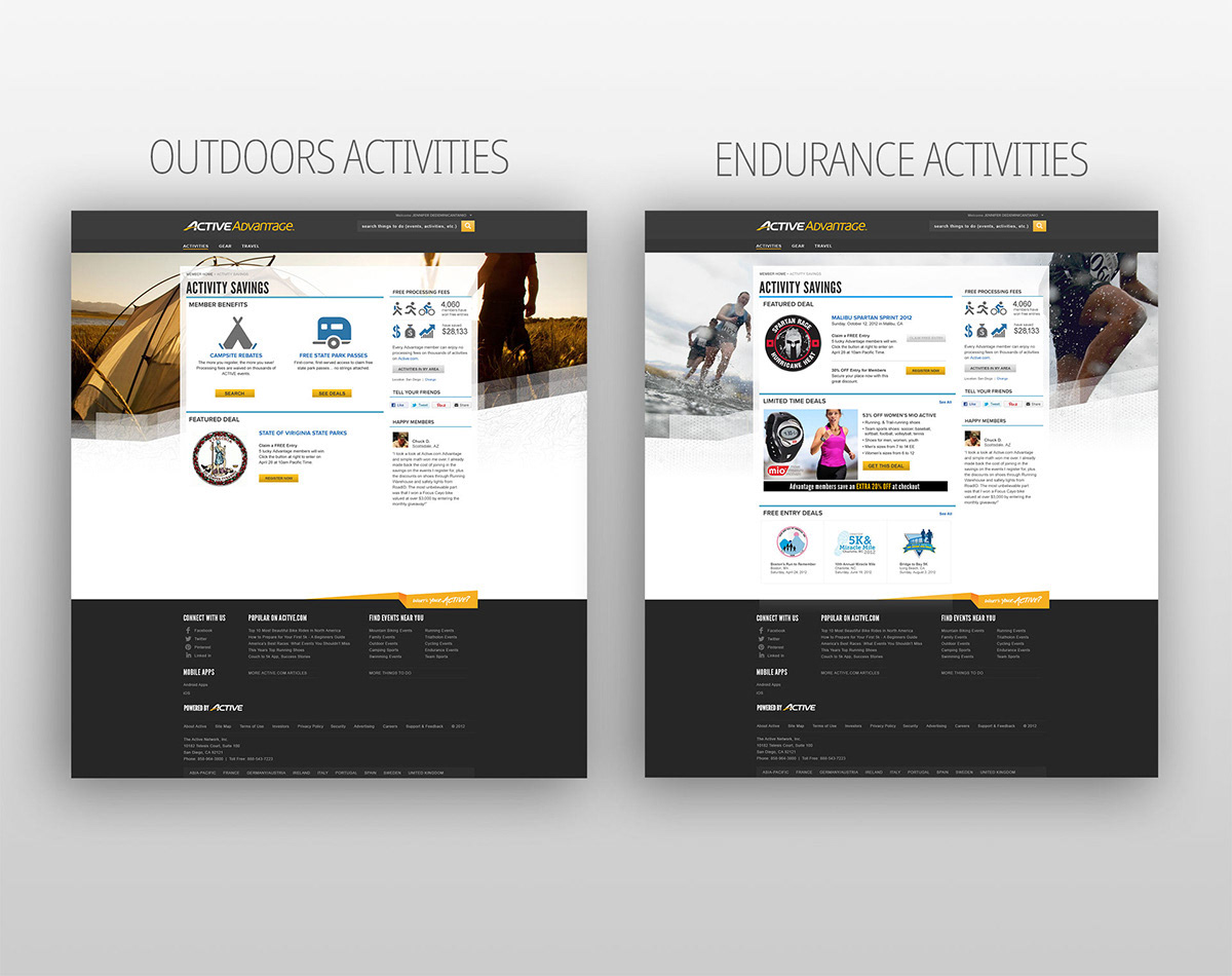
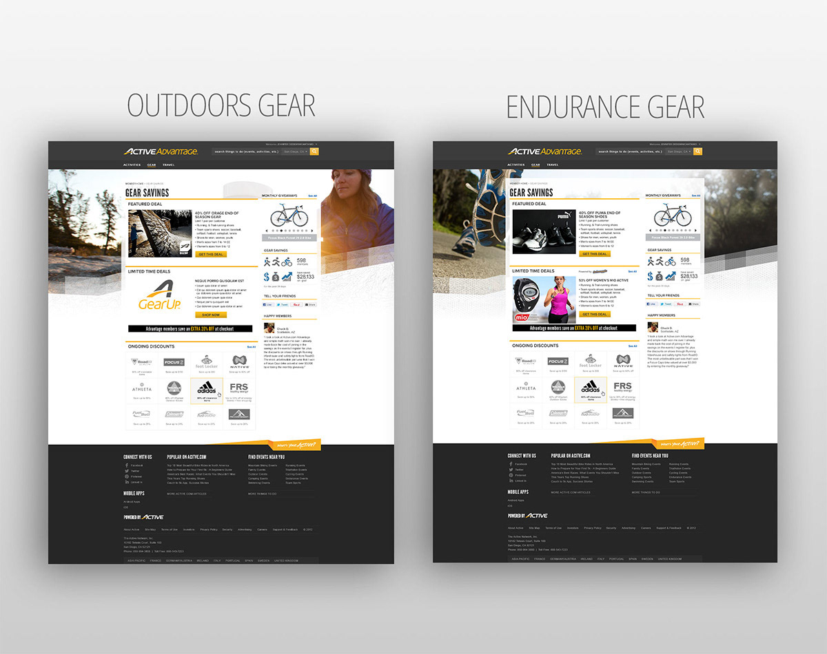
The ask was to start with an endurance focussed site and follow that up with an outdoors focussed version, as well. With this in mind, I needed to think through a templated system to help the company be faster at launching different versions of the site for different markets. On top of that, I needed to keep in mind how it responded to different devices, from mobile, to tablet, to full website. This means prioritizing and simplifying key components and identifying the breaking points of all the sections within the site.
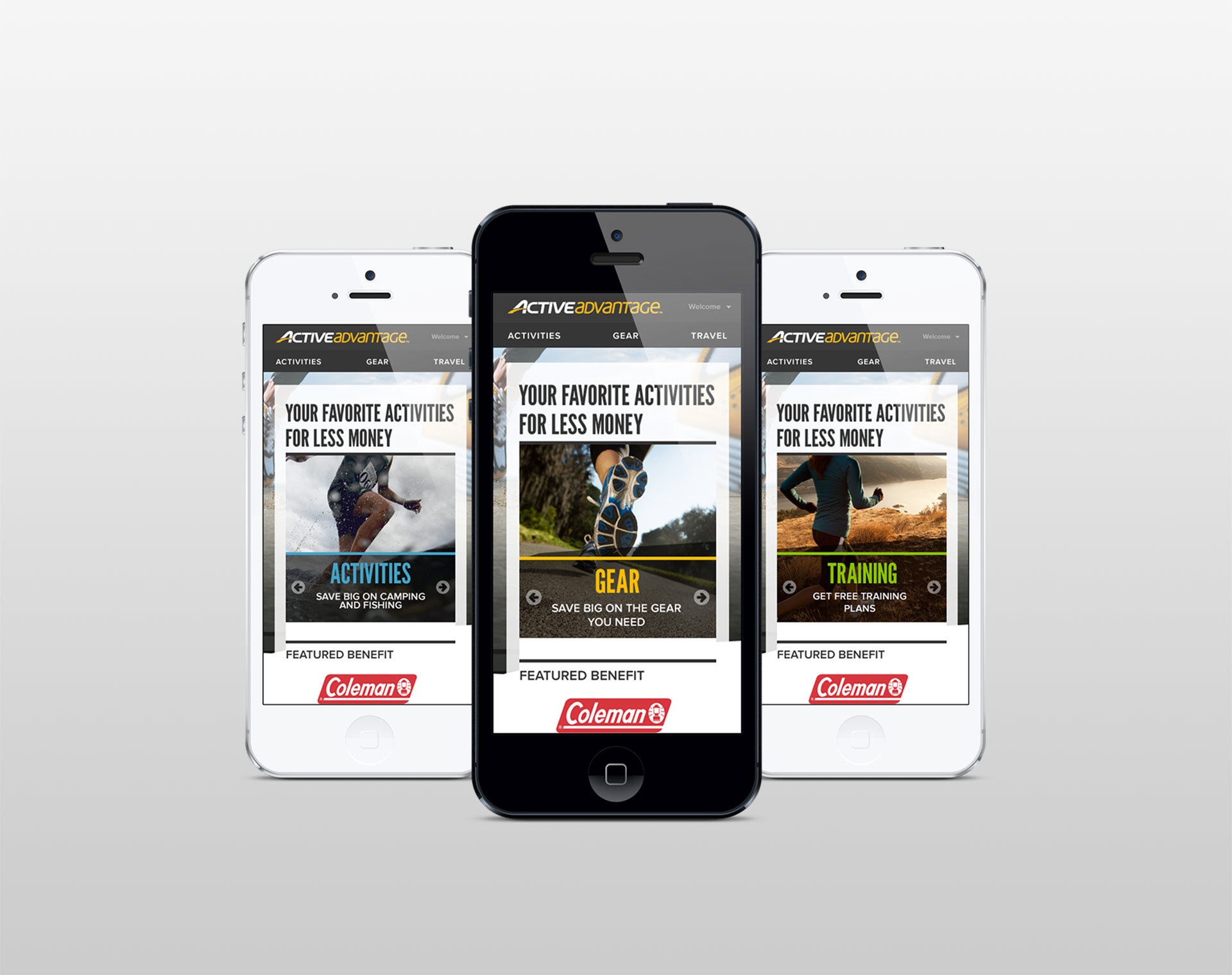
The concepts I created for the landing page designs used parallax/motion. When a user scrolls, new product items emerge, like bubbles fading into view. Each of these items gives users the ability to learn about some key rewards they can earn/win through Active.com. This use of animation makes the message we are sending, more interesting. We really wanted to push the company out of complacency, where previous web designs sat. You can see even more analysis of the landing page designs, on my behance page, located here.
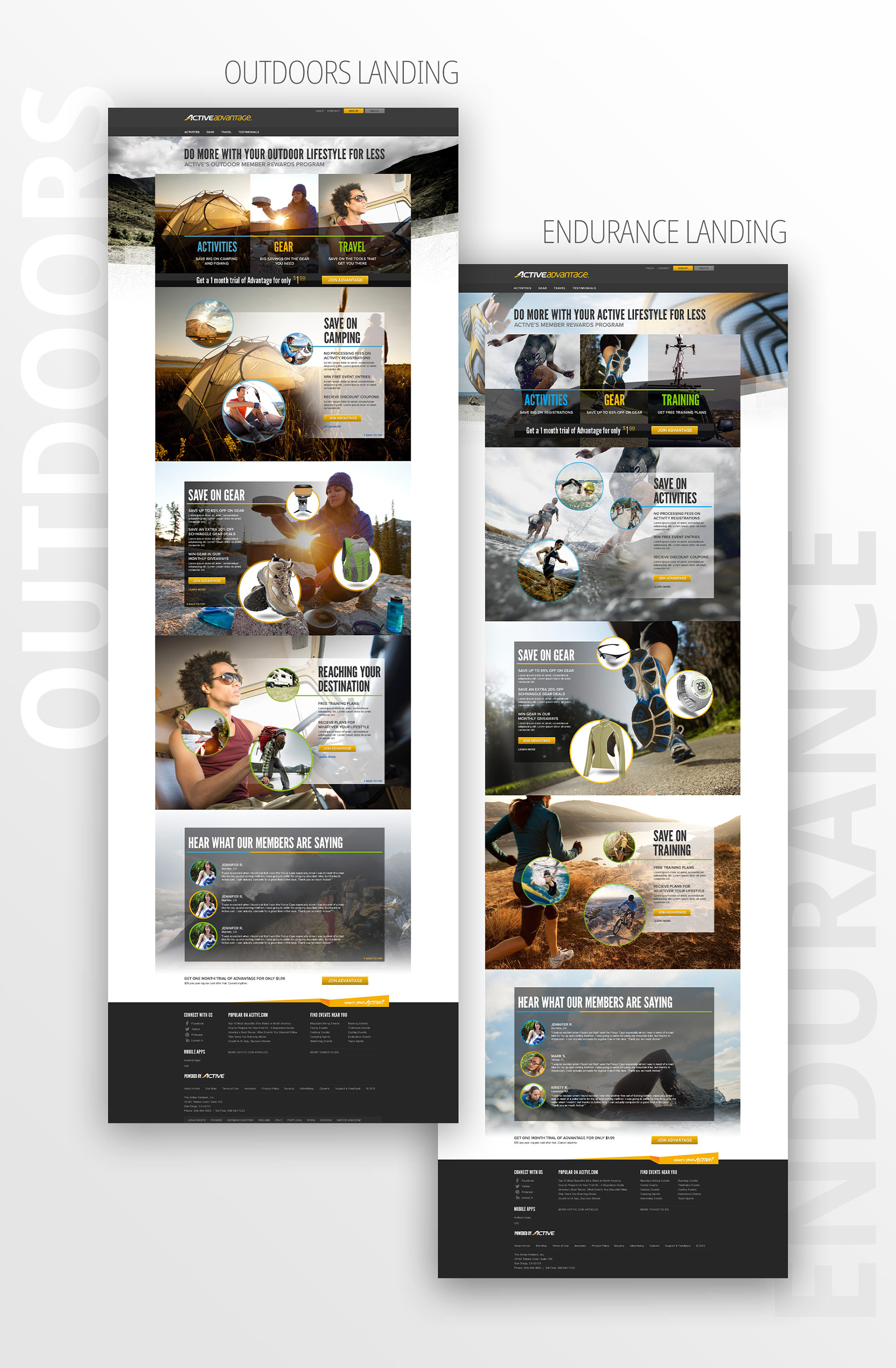
So, how can we start to build delight for customers? First, we need to make it easy for them to navigate to the deals they want. A good website starts with good architecture. We tested different navigations and came up with a new simplified approach. We also introduced the ability to be more social so they can share these deals with their friends. Combine this with a more fun and modern, visual approach, and we win more customers.
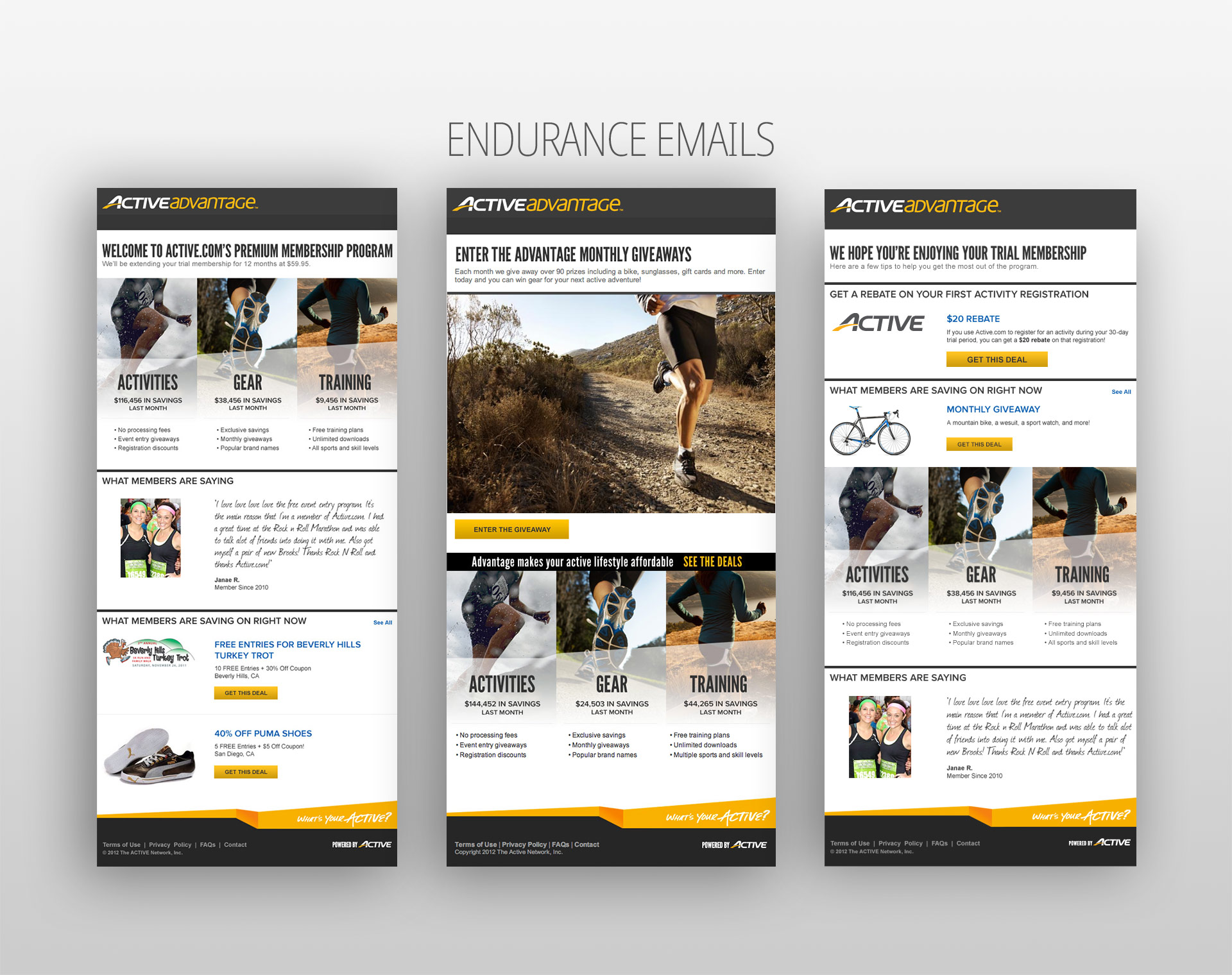
Email Template Designs
I created matching email templates for both the Endurance and Outdoors systems. This was done through a modular design where sections can be copied and pasted in specific orders, depending on the ask.
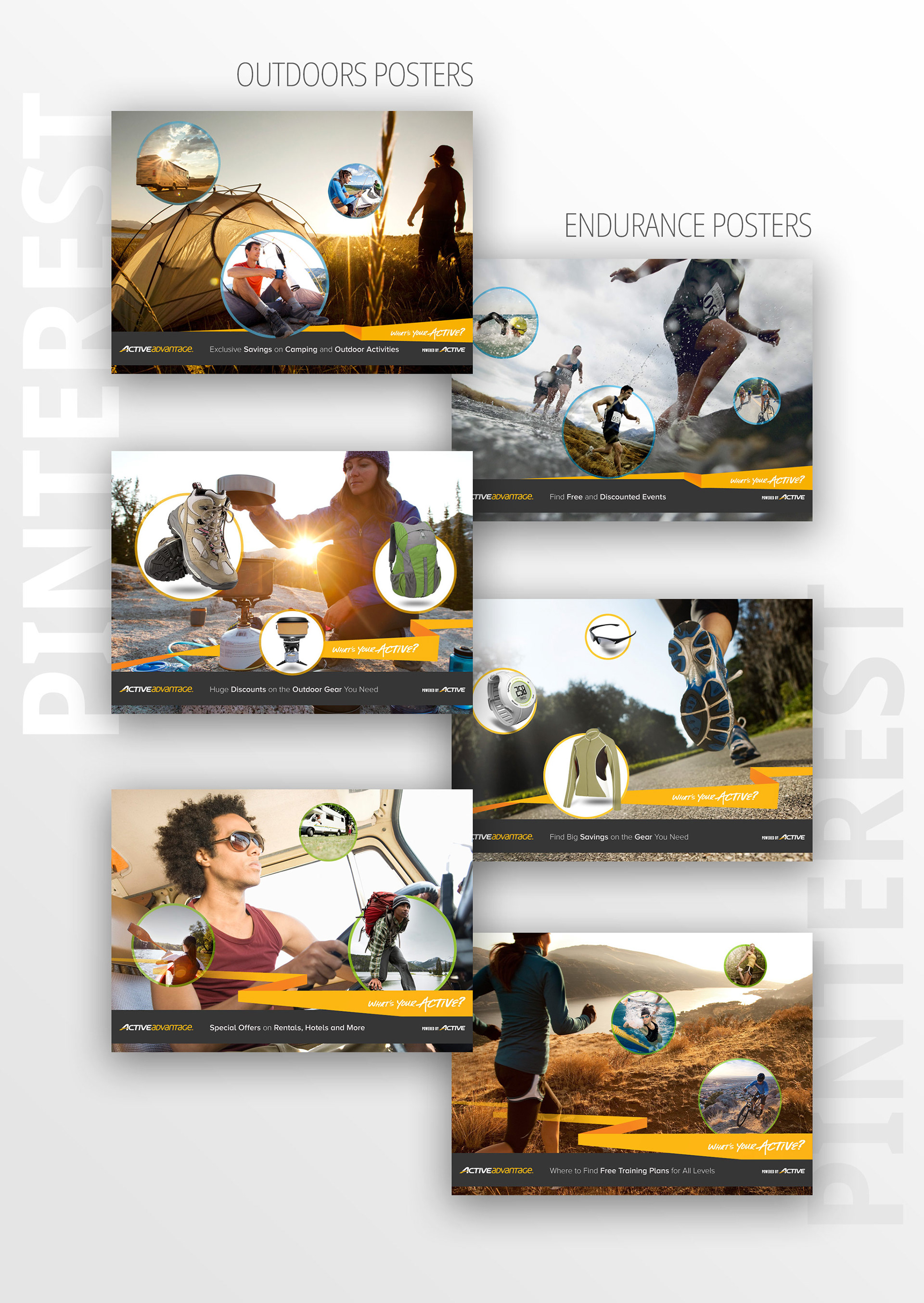
Visual Pinterest Poster Designs
Finally, I created a series of posters to use when users click the "Add to Pinterest" button anywhere on the site. This helps add to the social aspect of our site.