The Product Team
---------------------------------------------------
Josh Mead: Industrial Design lead
Scott Rickes: UX lead
Sean Zimmerman: UI lead
-----------------------------------------------------------
In January of 2020, scientists in Australia were first to sequence the Covid virus’s genome, using the SeqStudio Genetic Analyzer. This sequence provided the roadmap to creating a diagnostic test.
Overview
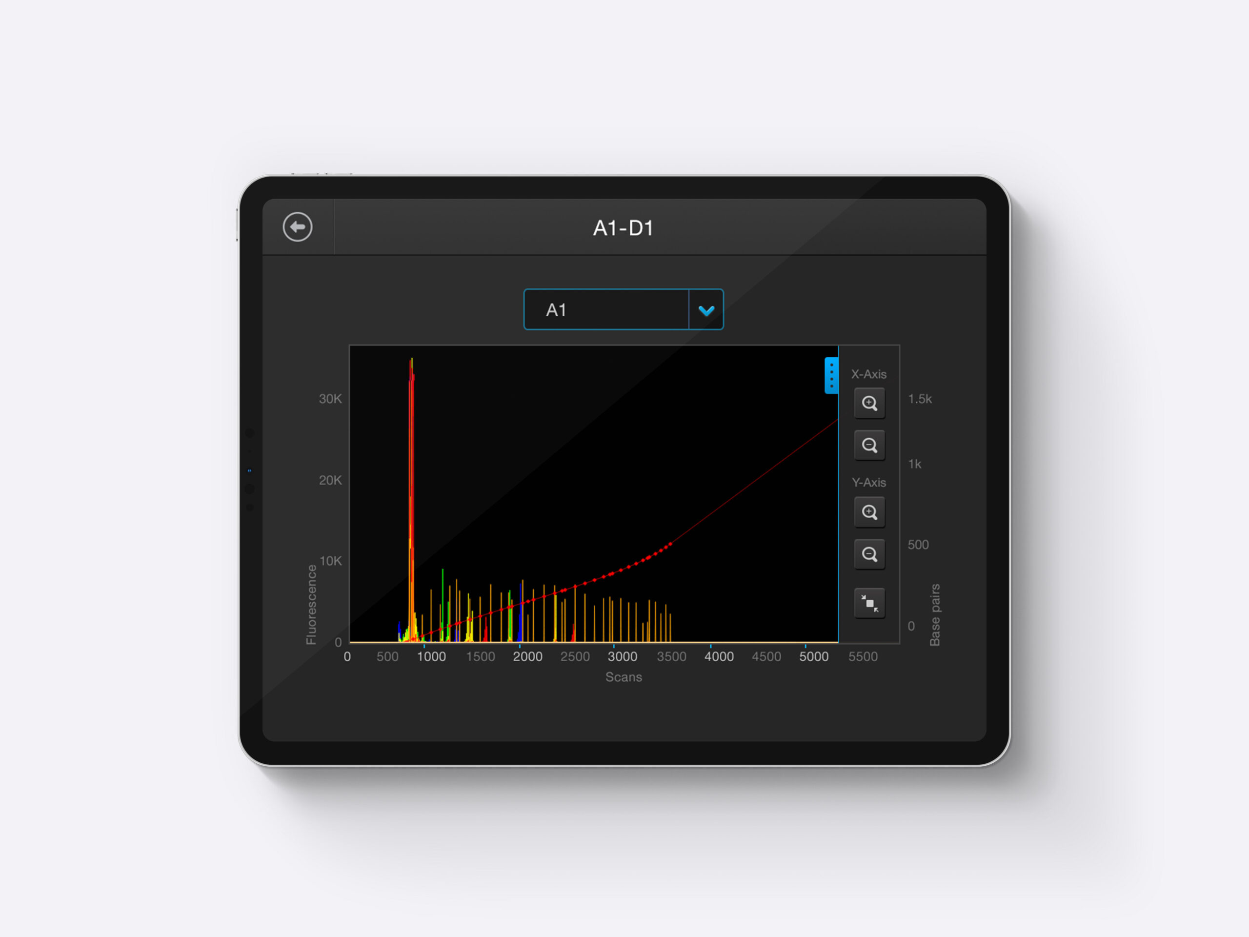
Designed for use by research assistants & scientists, the SeqStudio Genetic Analyzer is a low-throughput, easy-to-use system that makes running capillary electrophoresis (CE) experiments easier. It also facilitates collaboration through Thermo Fisher Cloud based sharing and applications, and introduces new opportunities to run both sequencing and fragment analysis samples at one time.
The Challenge
Introduce a new design philosophy to a set of customers, in a completely different field of science. Something I can tell you about scientists is they don't like change. When something "seems" to be working for them, they really don't want to change anything. Our new approach will make setting up a run faster, with the ability to share information and collaborate like they had never done before. Also, this analyzer should be able to perform simultaneous sequencing an frangment analysis runs on the same plate. With this in mind, we would have to create easy-to-use plate interactions, while simultaneously able to share this information in the cloud.
My Approach
To work with my UX partner, who has taught me so in regards to touch screen interfaces - to apply the craft with some of the best looking, easy to use interfaces out there.
The Philosophy
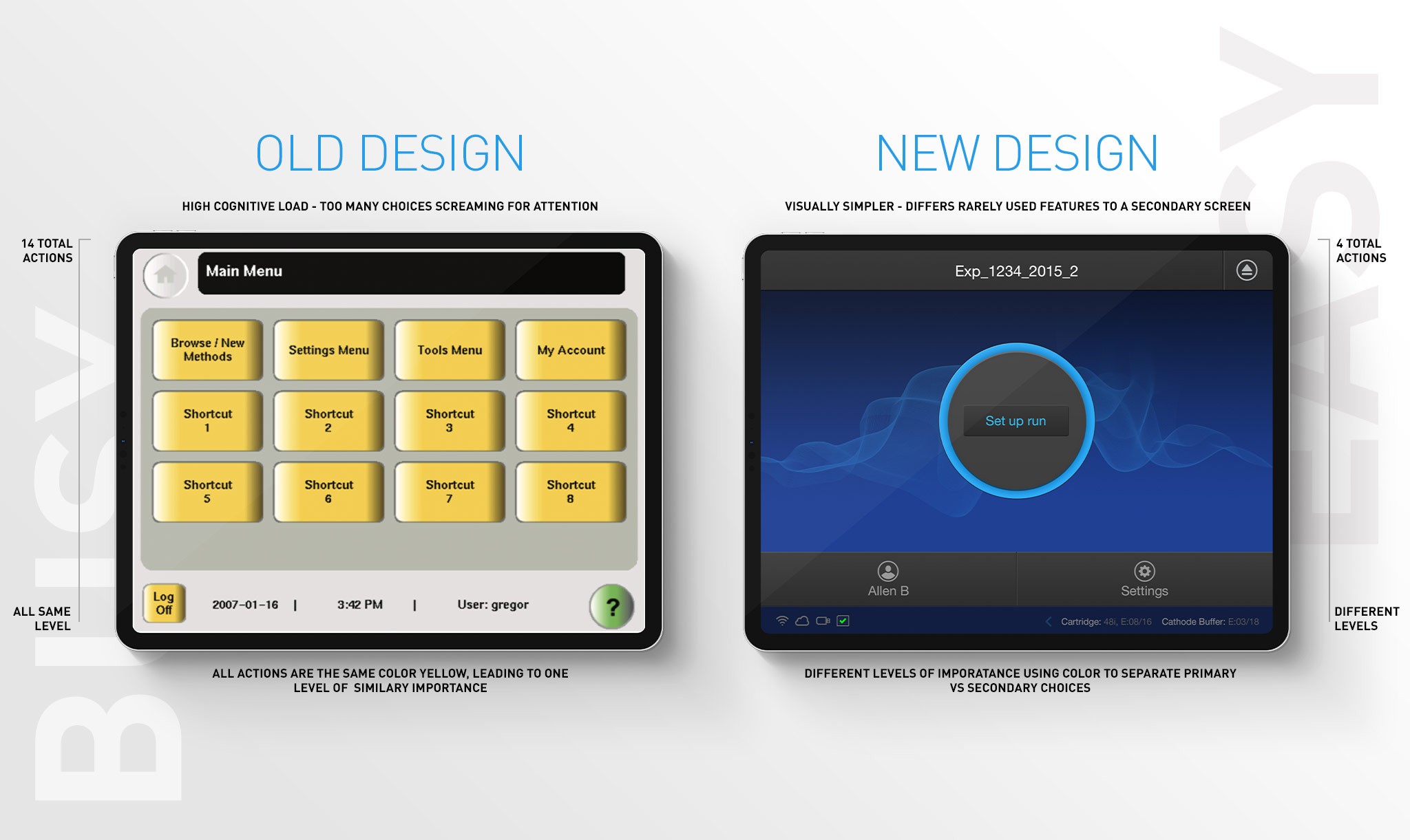
Something I didn't get into enough on the last project I showcased, was the philosophy our team pursued particulary for our embedded user interfaces. It became truly important to think of these designs as if they are mobile applications. This idea seems easy enough. Just make the interface as simple as possible. But, what does this mean? It means that as designers, we need to break everything down to it's simplest forms. Take this graphic, for example:
Philosophy Continued...
Look for and identify what the primary focus is, of each page. There is always 1. It's our job to identify it and keep the flow moving forward. By simplifying items down to one task at a time, it's easier for the user to feel they are in control. This is the core of the philosophy. At the end of the day, it is actually a well known philosophy, and it's called Progressive Disclosure. The idea here, is simple: defer advanced or rarely used features to a secondary screen, making applications easier to learn and less error-prone. As a team, we took this philosophy to the extreme.
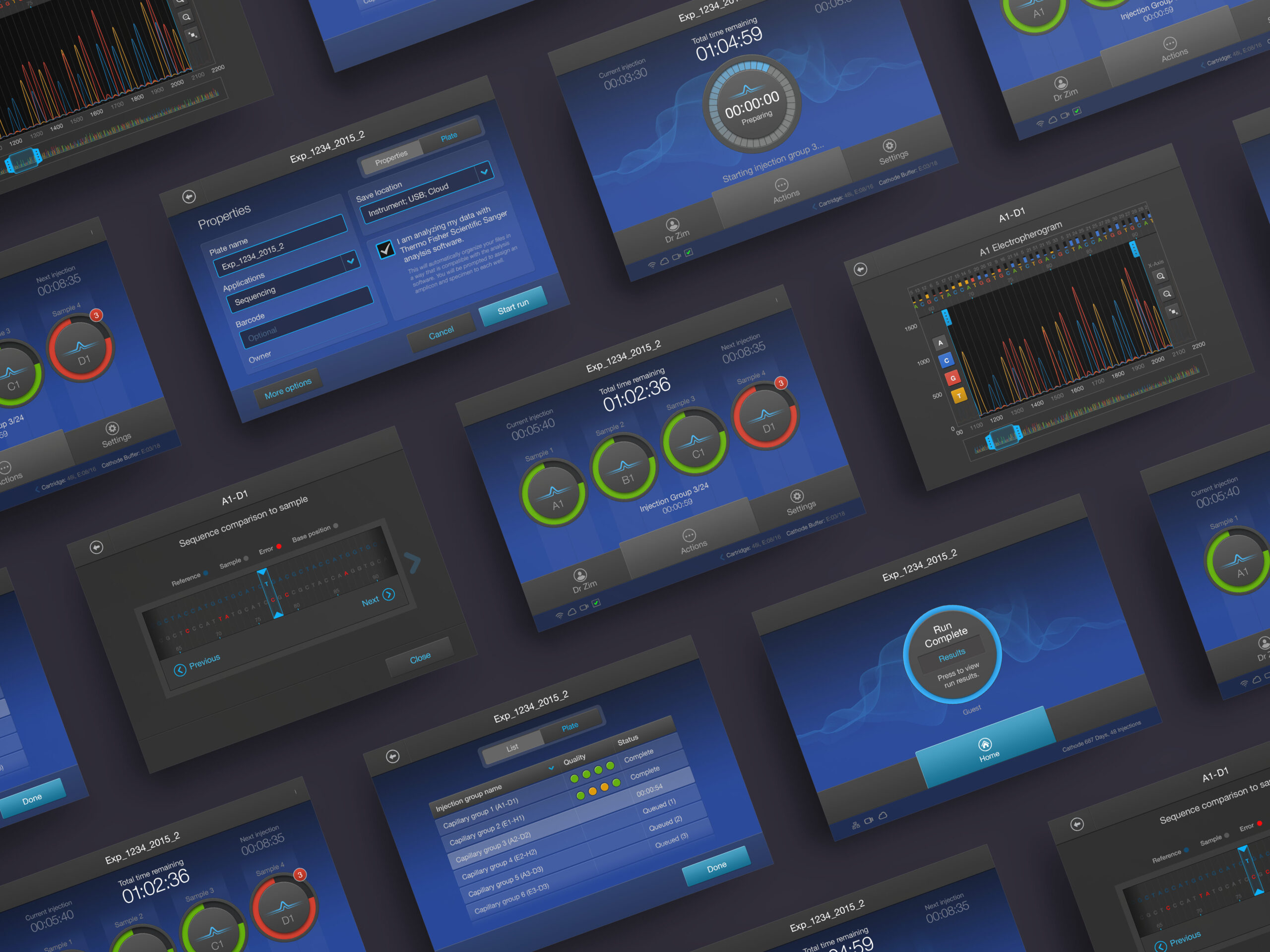
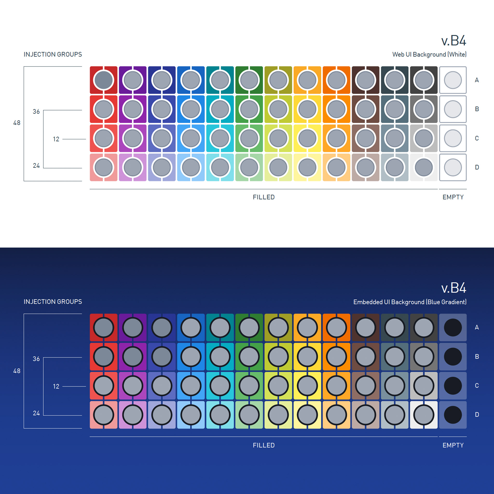
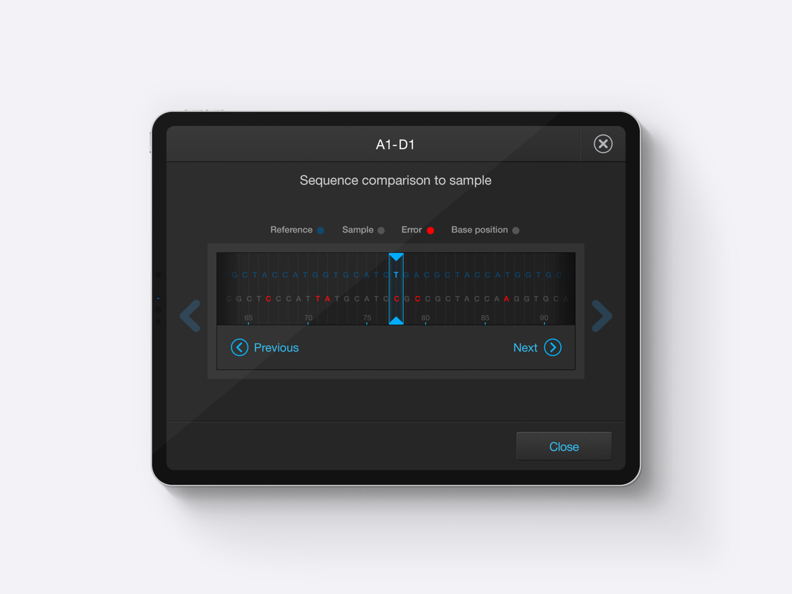
Color Studies & Plate Design
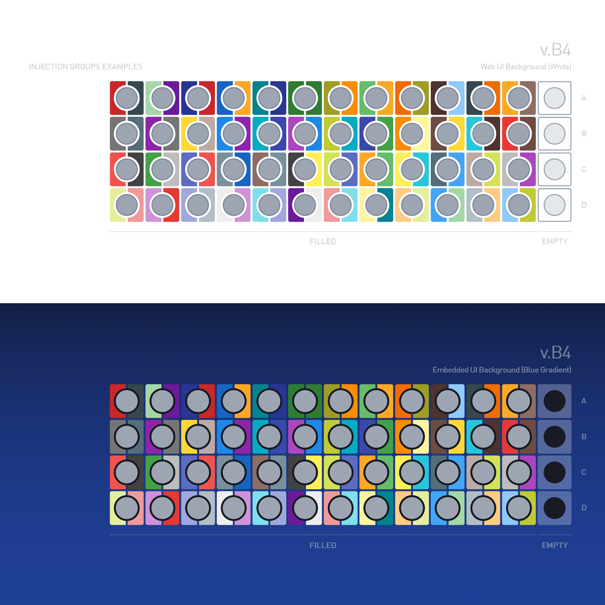
As I mentioned, plates are a big deal on this project. The scientist needs to be able to set up runs by matching their plate layouts with the digital equivalent. Because of this, we needed to do a color study on white (analysis web application uses a white background) vs the darker blue on the instrument. In an ideal situation, we don't ever change colors based on the background. The studies seen below were completed to make sure the colors chosen are accessable in both scenarios. We also provided an order of colors to choose from - first 12, second 12, and so on.
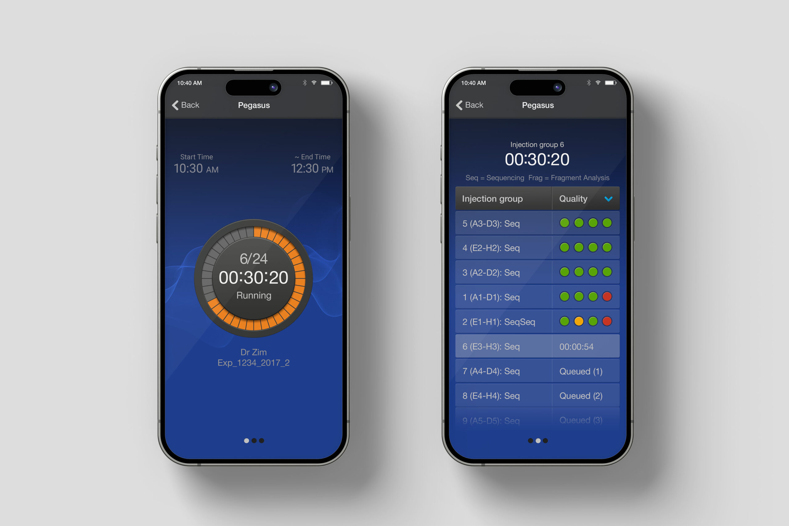
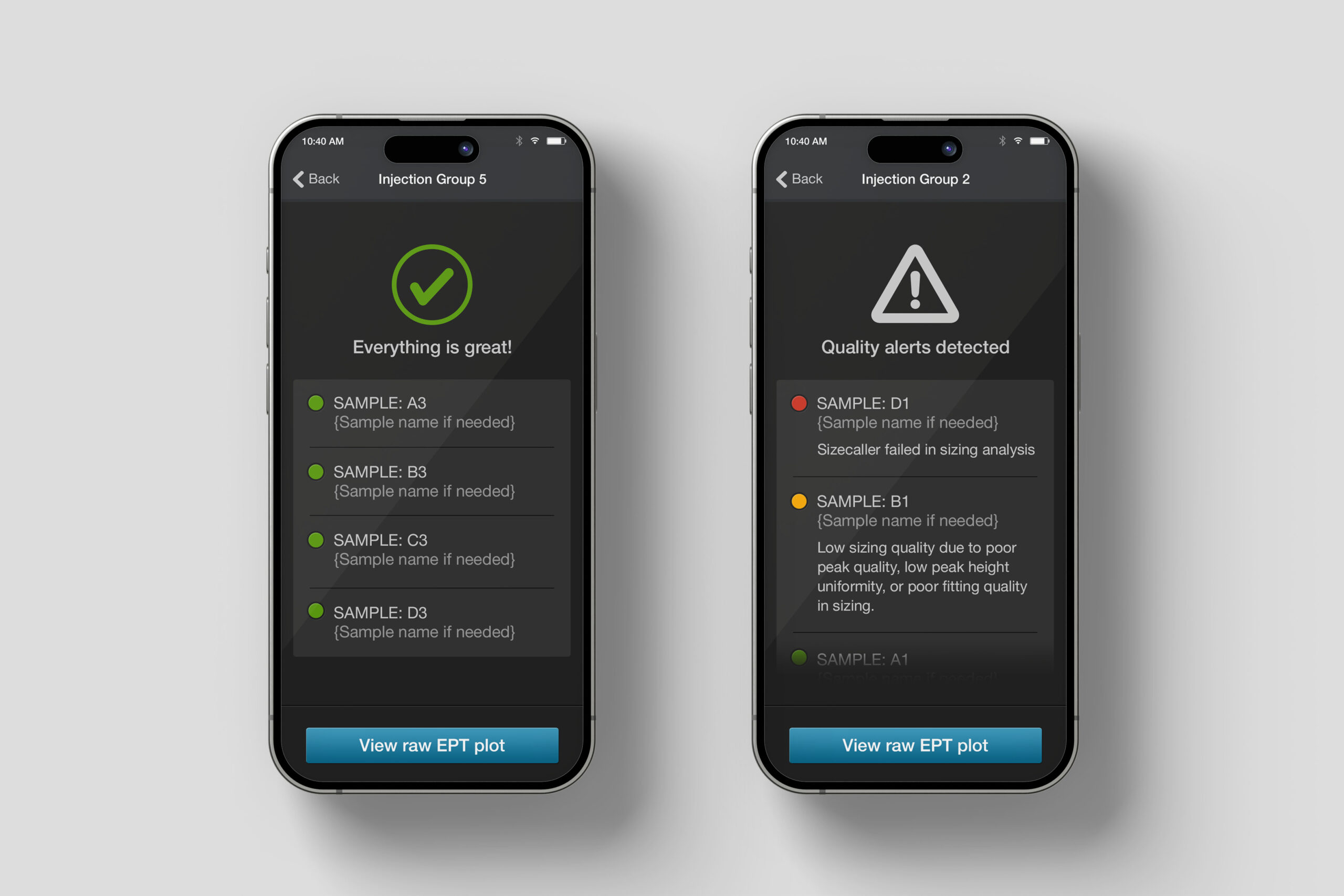
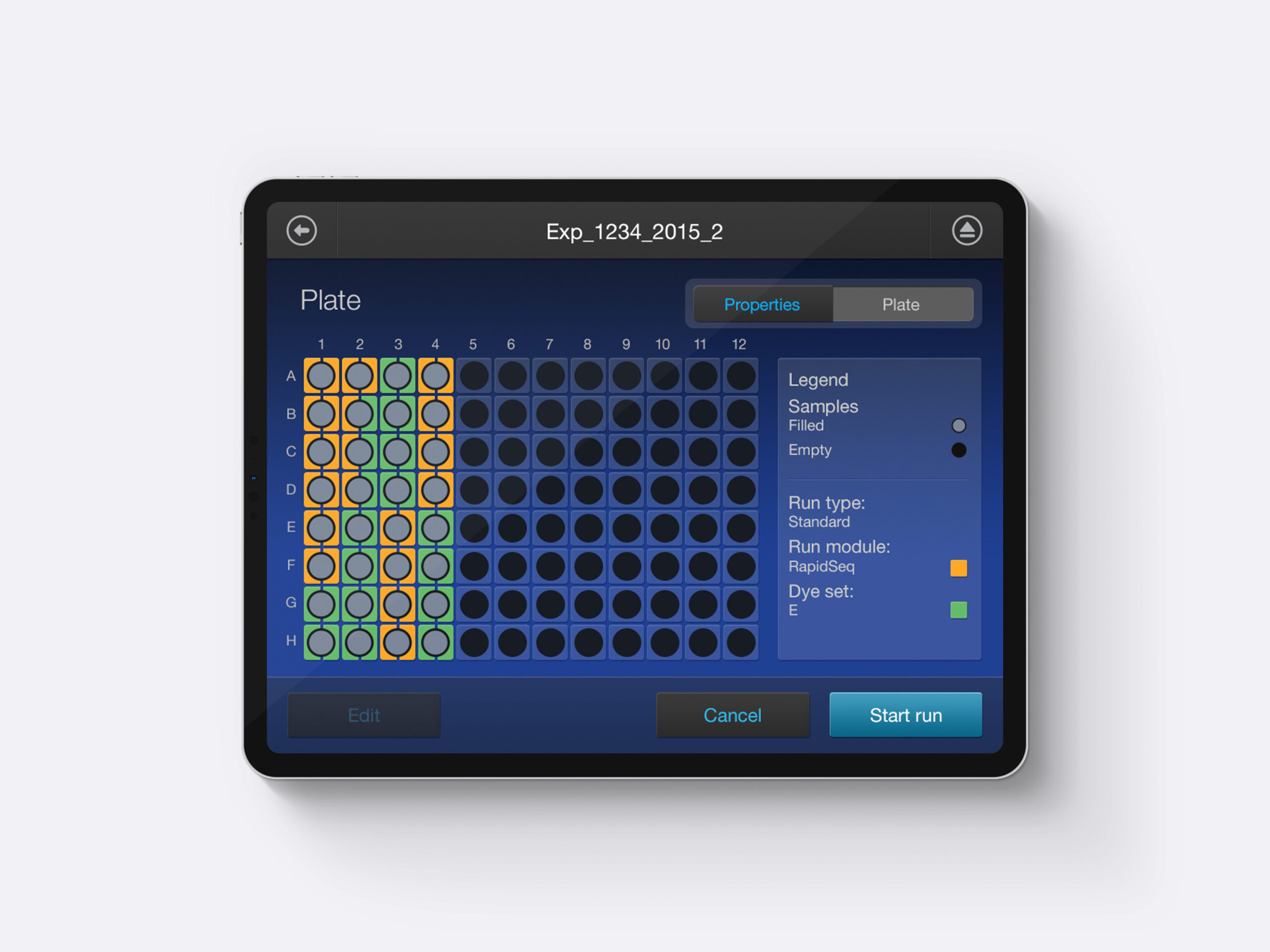
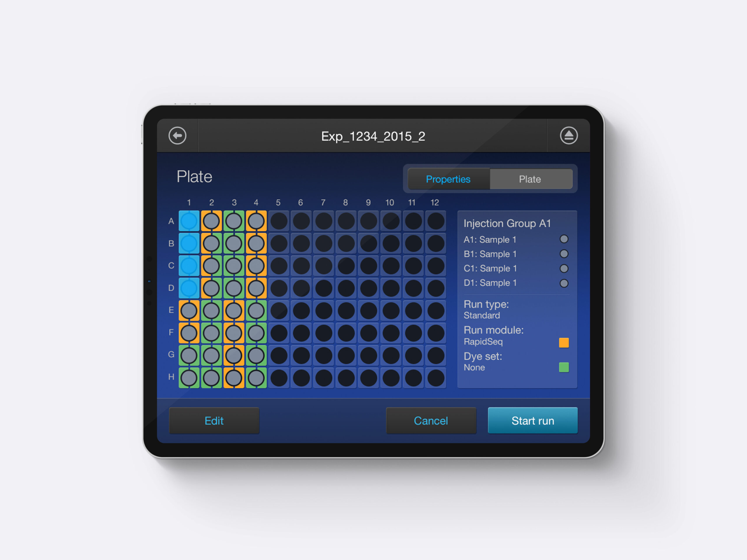
Below that are a couple examples of plate interactions. Being able to provide the user a legend to help identify how to read the plate layout was very important. And, when they need to select an injection group, the information they need jumps front and center.

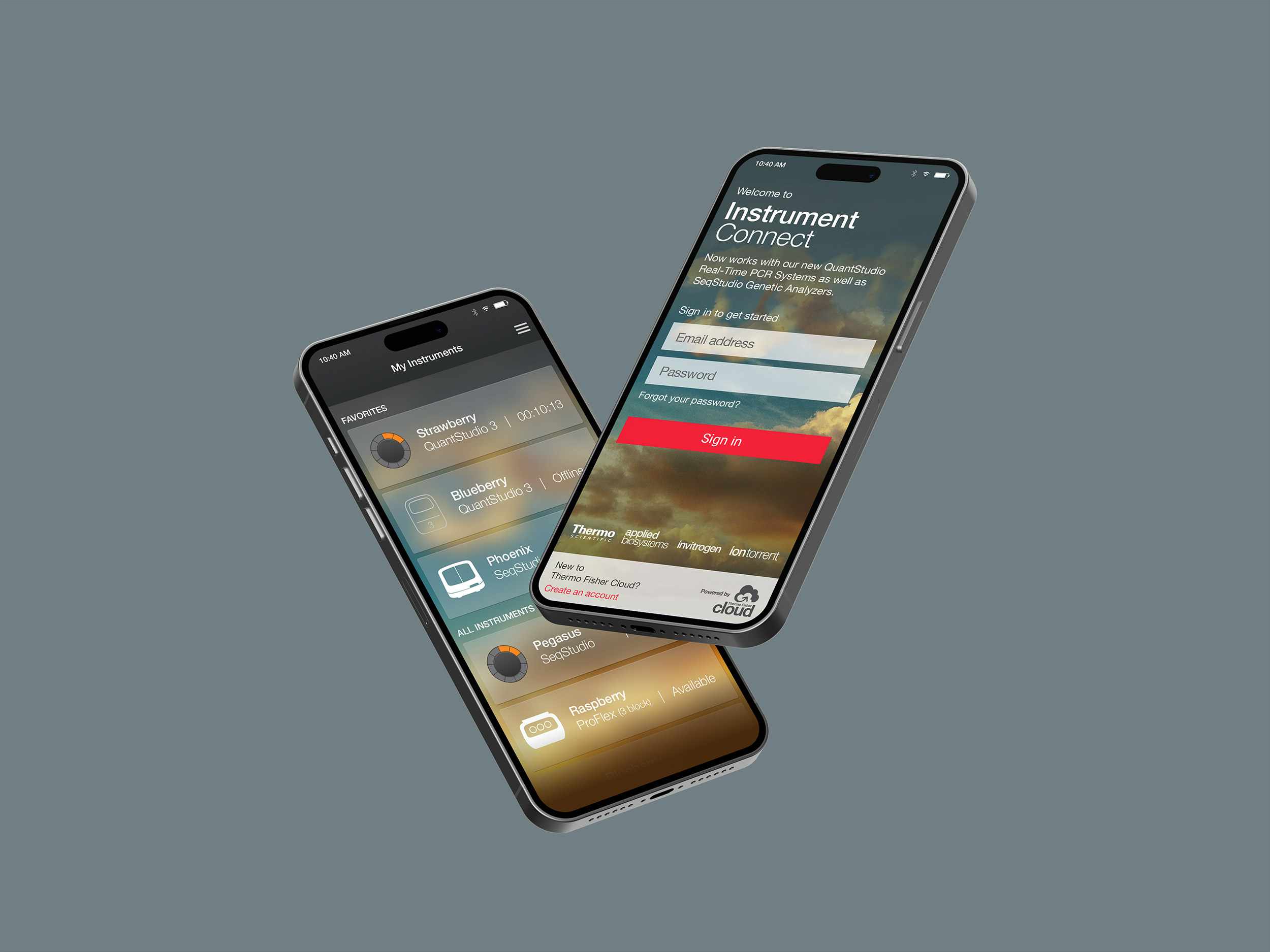
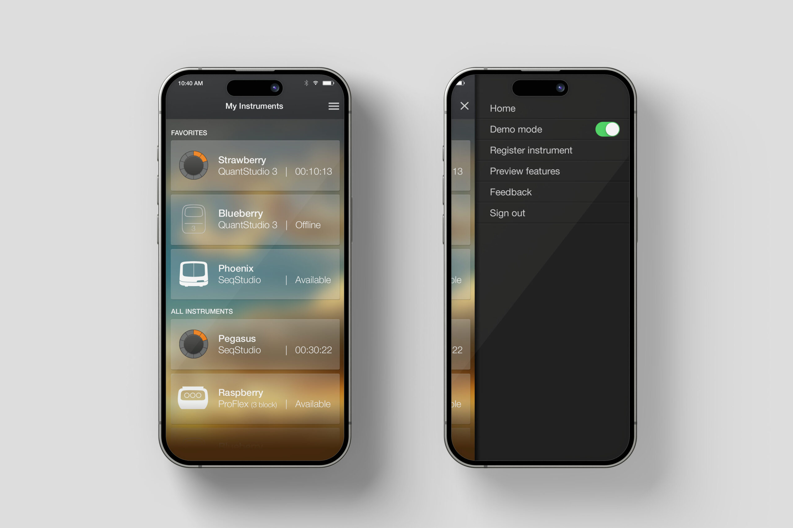
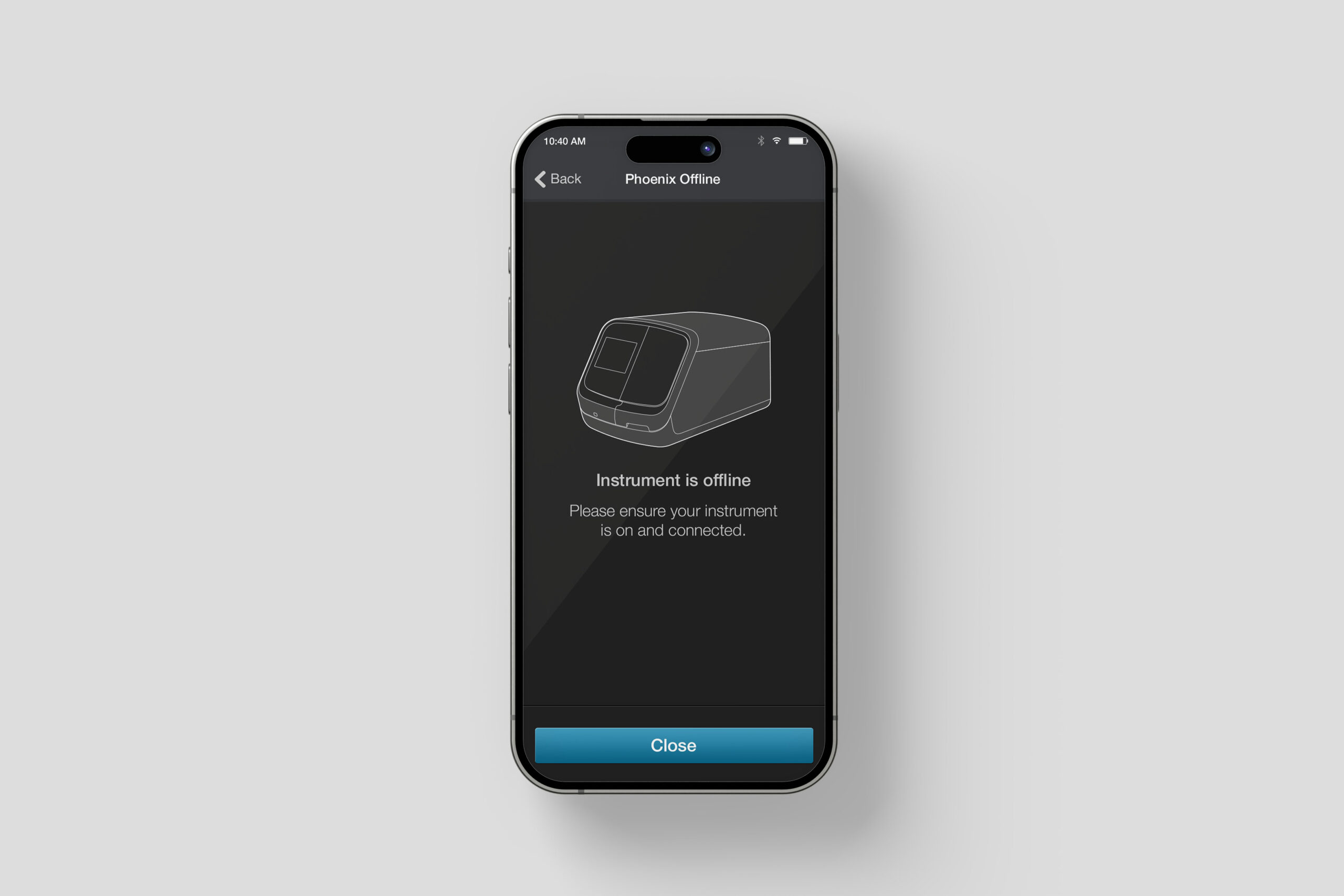
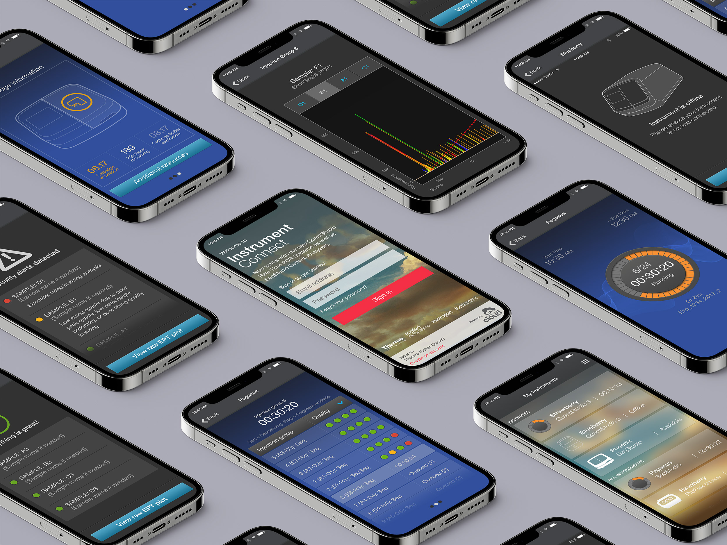
Instrument Connect - Mobile Application
As I mentioned above, one of the core items identified with the release of the product, was it's ability to share information to the cloud and allow for scientists to be able to keep track of their runs while away from the lab. For this product, we created a way to achieve this through a mobile application called Instrument Connect. Collaboration and freedom were front and center when putting this app together. I did both the UX as well as the UI designs for this project.